
I joined On Deck as Lead Product Designer in April 2021 and moved into a Product Design Manager role a year later, growing the design team from two to five as the company grew. While splitting my time between my managerial and design responsibilities, I took on one of the more complex projects of my time there: a full profile page redesign and a segmented migration strategy.
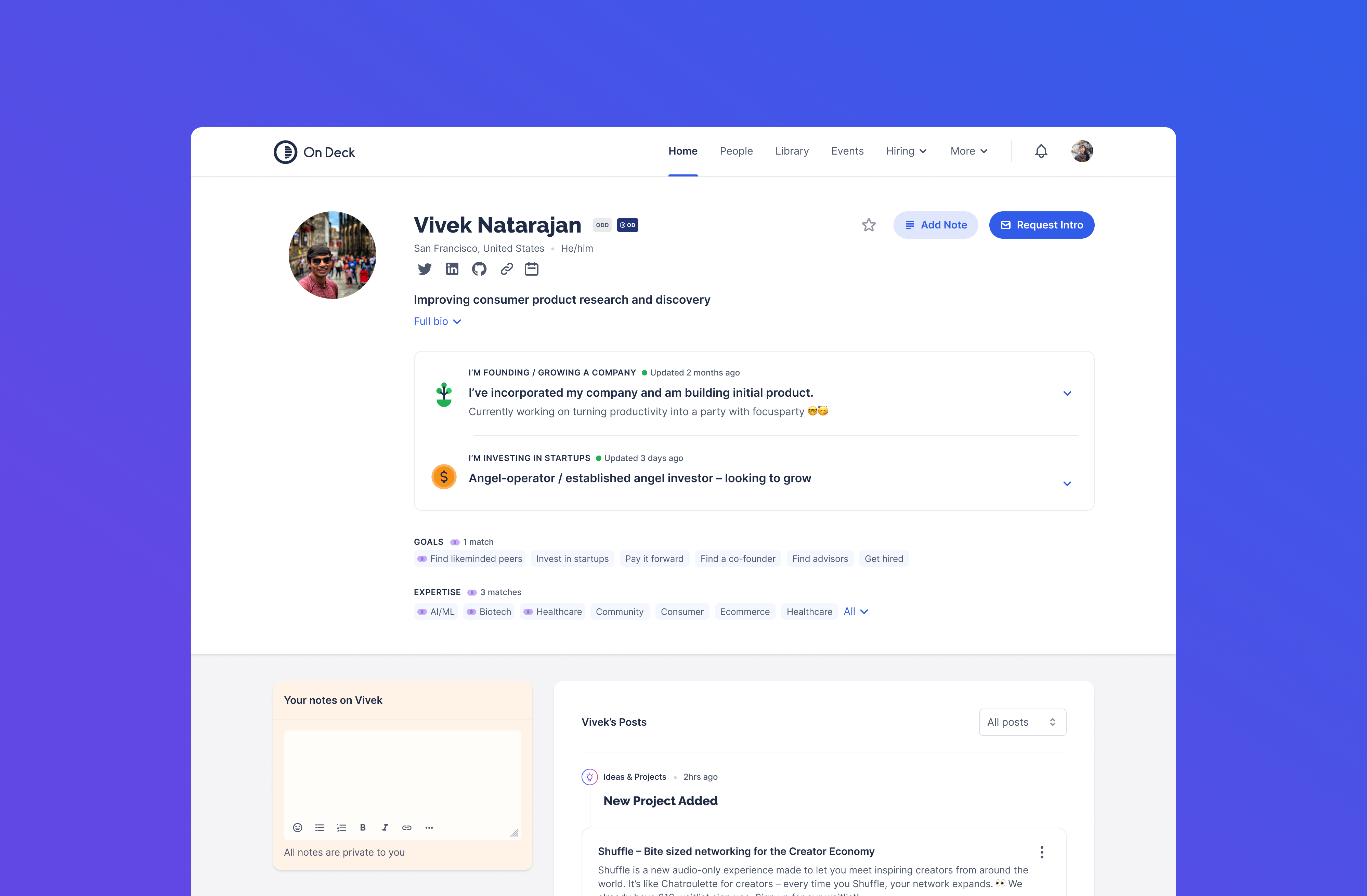
On Deck's entire value proposition rested on its community — the peer connections, introductions, and shared context that made membership worth having. As the platform scaled past 10,000 members, that value was at risk: outreach between members was declining. It was clear that the profile page — the primary mechanism for discovery and connection — had stopped doing its job.
Engagement data from Mixpanel and in-person user interviews pointed to the same problem: the profile page had lost its utility. Users couldn't tell who was still active on the platform. That ambiguity eroded trust — if you can't gauge whether someone is likely to respond, you don't reach out.
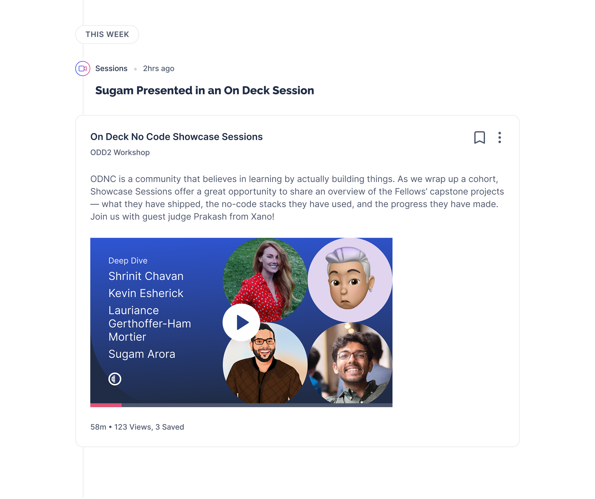
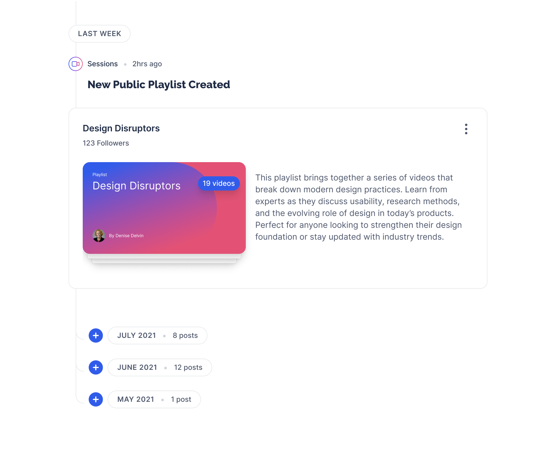
As well as date stamping profile updates, the central addition was an activity feed. Surfacing a member's recent platform activity served as proof of engagement. For members browsing the community, it opened up a secondary entry point into content, sessions, and playlists.
A redesigned profile is only as good as the data behind it — rapid growth and multiple rounds of onboarding iteration had left the underlying data fragmented. Profiles held different fields and different depths depending on when a member had joined — some were rich and complete, others near-empty.
We developed a segmented upgrade flow based on three factors: the depth of information already held in a member's profile, their level of platform engagement, and how recently their profile had been updated. These three signals divided the user base into cohorts, each receiving a tailored experience — different outreach channels, different incentives, and a different set of steps to complete.
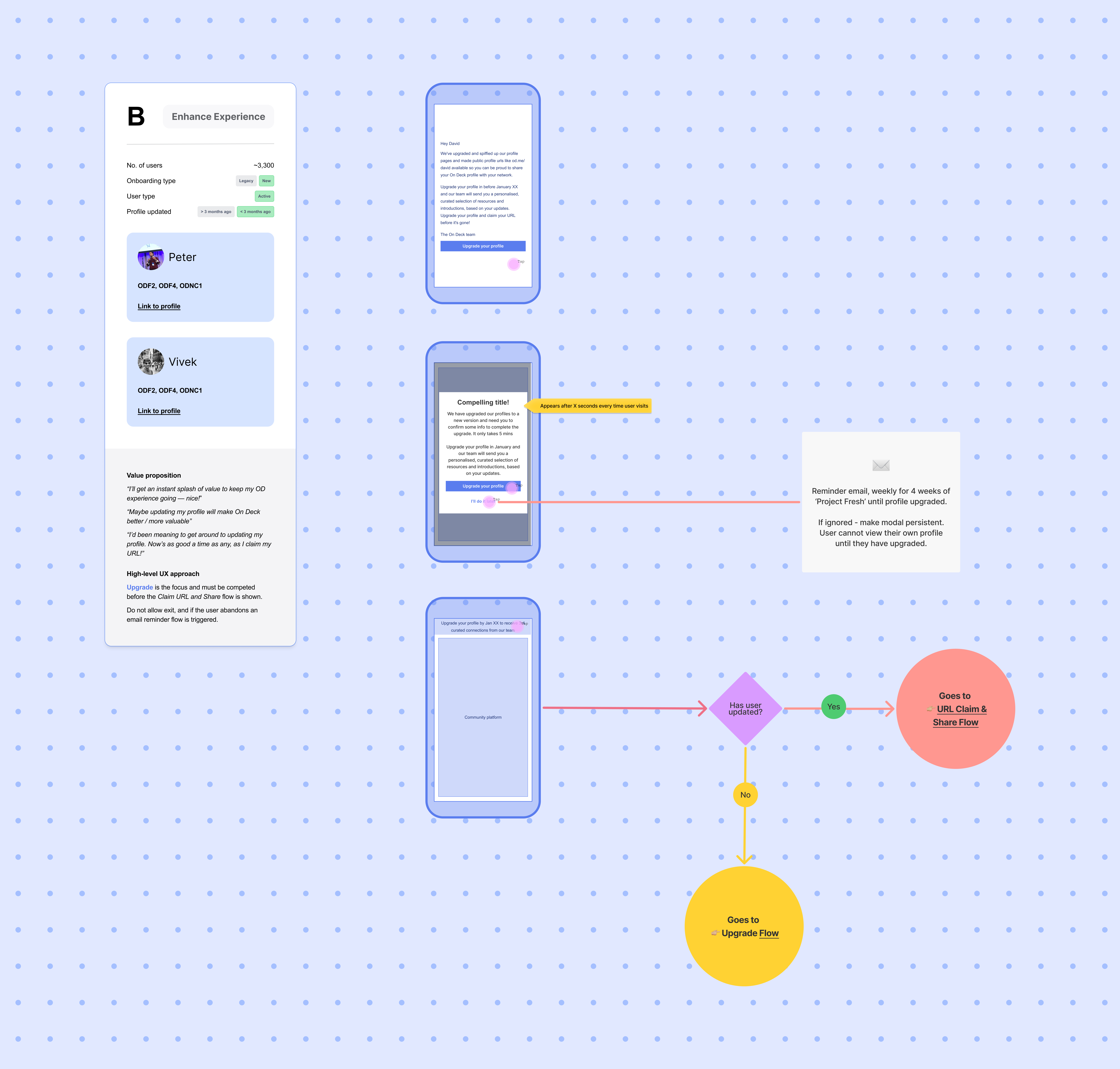
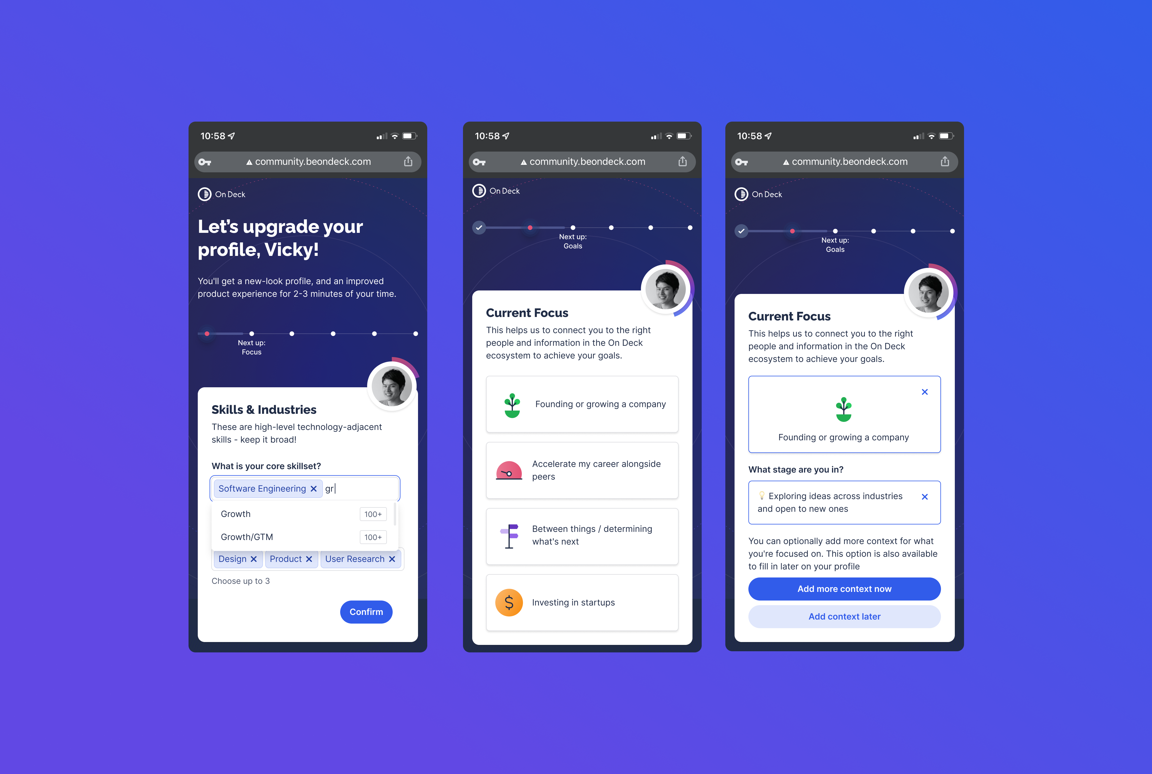
For members with rich profiles, the ask was light: a short confirmation and a few additions. For members with sparse profiles, the approach was softer — email outreach, gentler prompts, and clear framing around the value of a complete profile. A lot of the design work in this phase was sequencing and copywriting as much as it was UI.