My Process
Process
Process is extremely important to me as a designer.
The below illustrate stages that I may go through on any given project. It depends on the size of the project and the requirements as to how many, and which of these I would use but all are very useful in the right circumstance.
The below illustrate stages that I may go through on any given project. It depends on the size of the project and the requirements as to how many, and which of these I would use but all are very useful in the right circumstance.
01
User Research
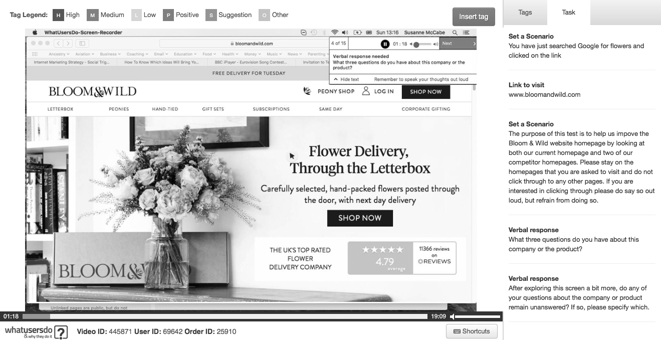
Remote user testing is an incredibly quick and insightful way to get feedback at all stages of the design process.
By setting up a schedule of regular, systematised user testing on key parts of the site you can identify issues with both qualitative and quantitative data.
Remote user testing is an incredibly quick and insightful way to get feedback at all stages of the design process.
By setting up a schedule of regular, systematised user testing on key parts of the site you can identify issues with both qualitative and quantitative data.
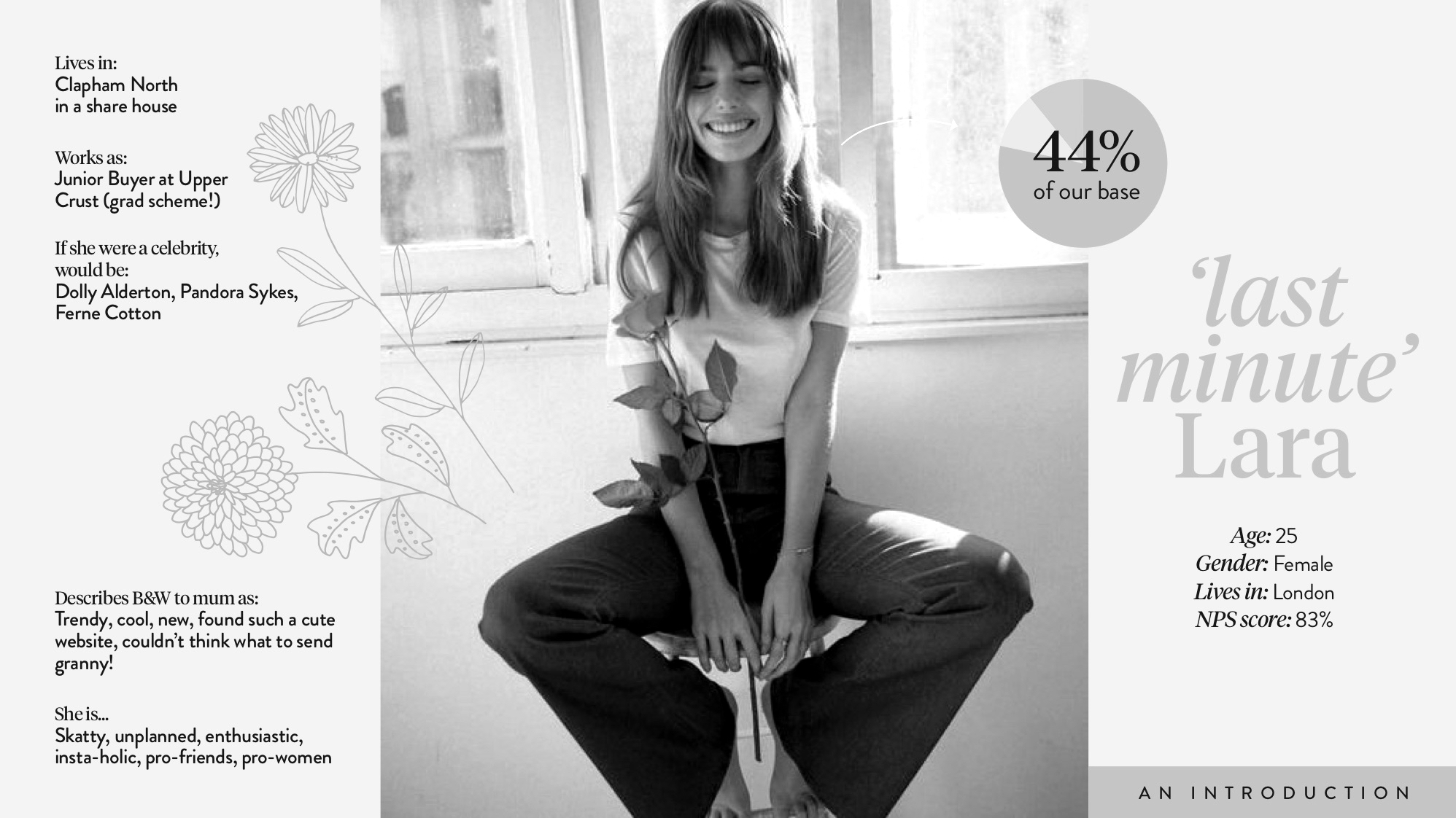
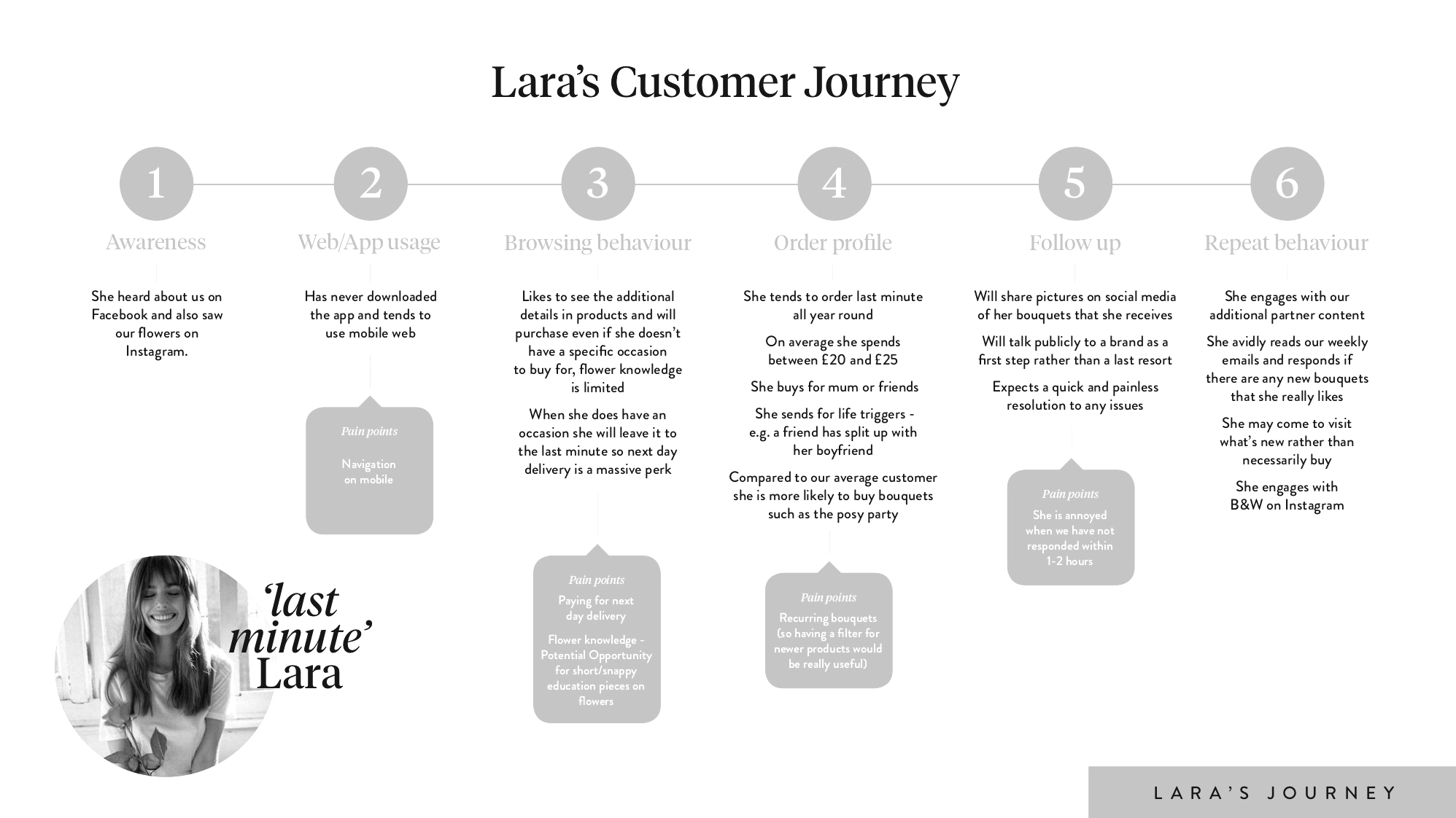
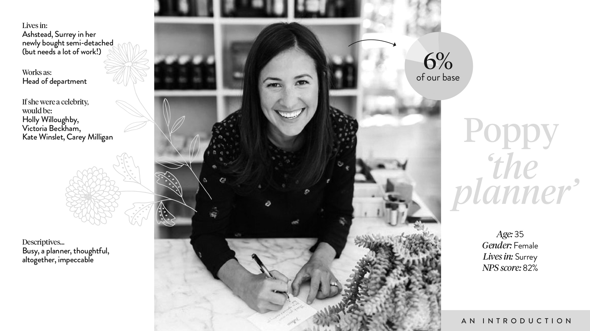
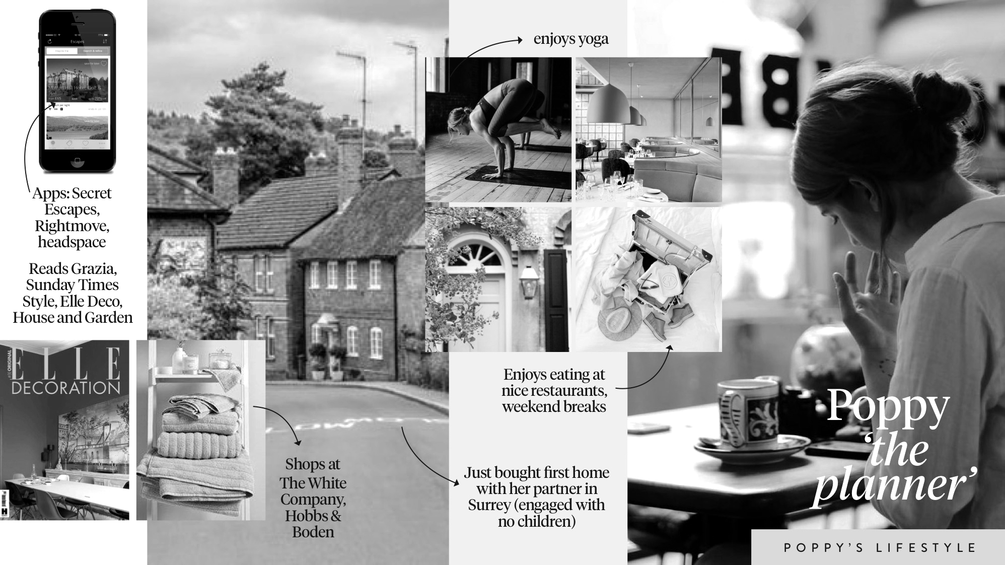
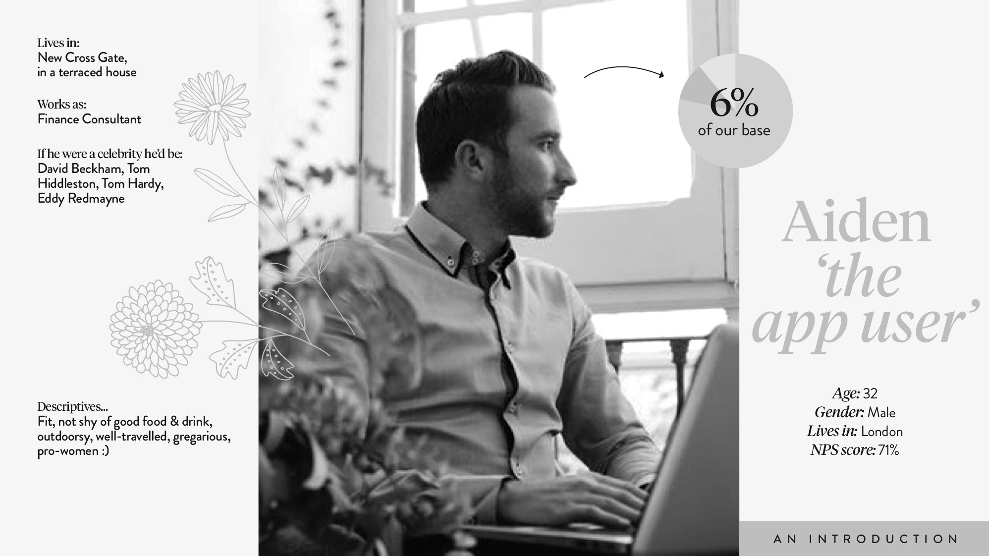
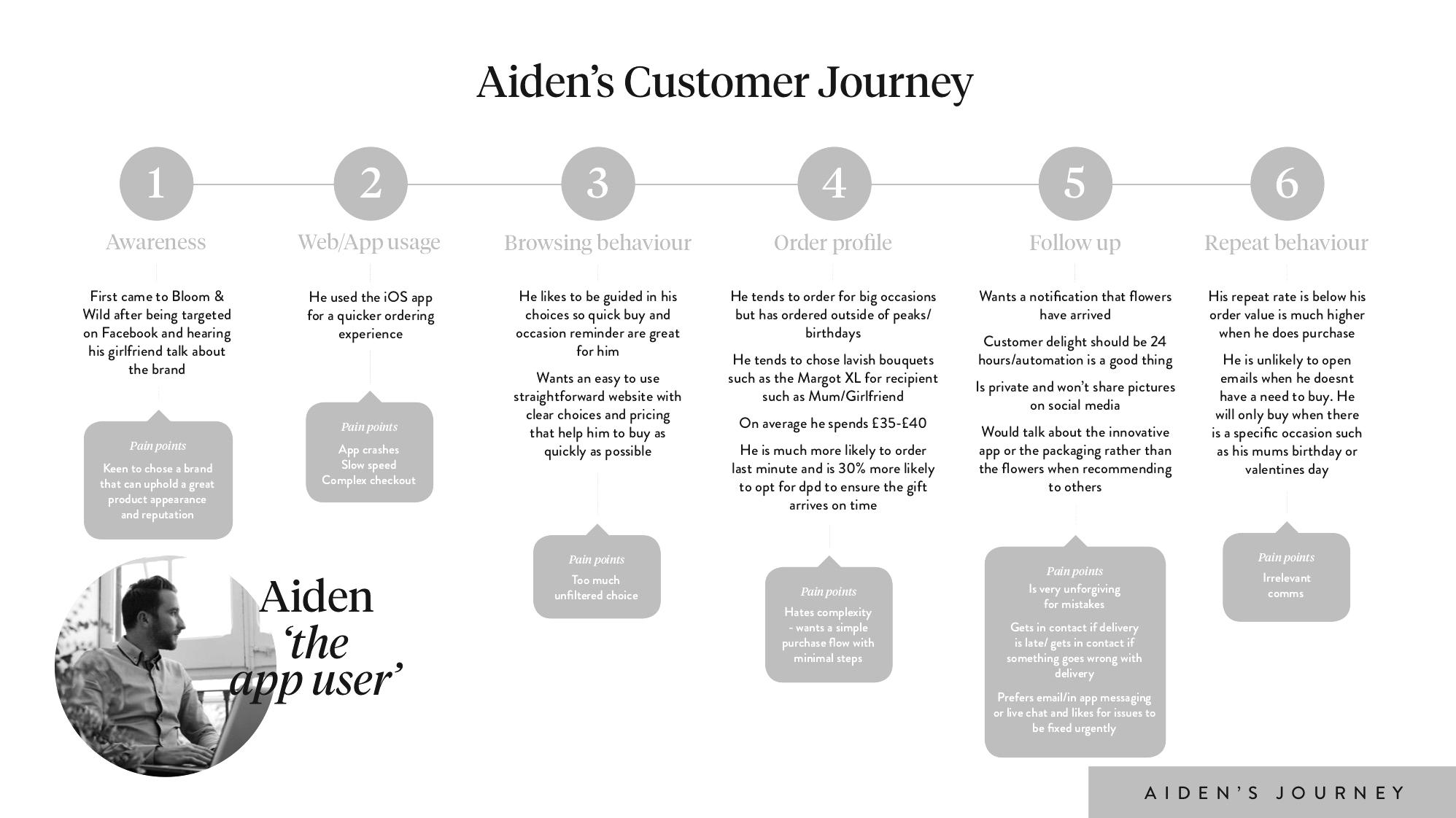
When tied to real data and insight user personas can be a really useful way to put yourself in someone else's shoes.
Considering the personas behind generic user flows can really help you to empathise with the emotion around and reaction to certain pain points and consider solutions from a user rather than designer perspective.
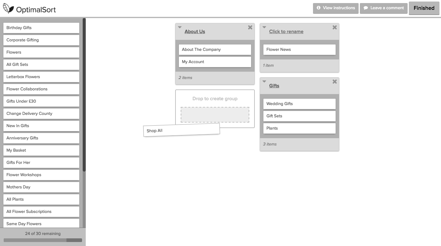
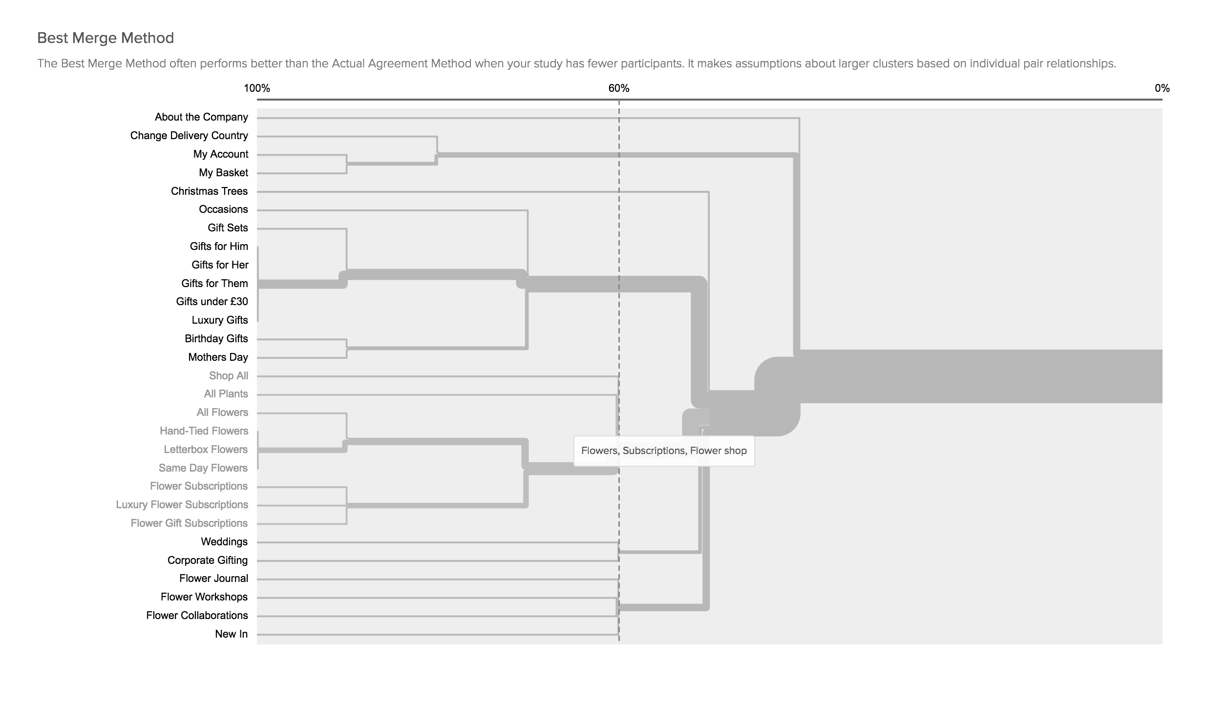
Tasks such as card sorting can also be a useful tool to get insight into the way people think and any existing mental models they have.
02
Working with Data
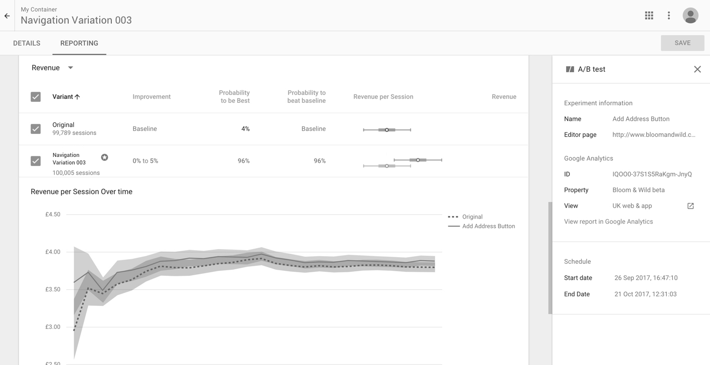
Striking a healthy balance between business metrics and user experience is key. Testing variations of design options via Google Analytics helps quantify any trade-off any significant change in user experience may have on key business metrics.
Striking a healthy balance between business metrics and user experience is key. Testing variations of design options via Google Analytics helps quantify any trade-off any significant change in user experience may have on key business metrics.
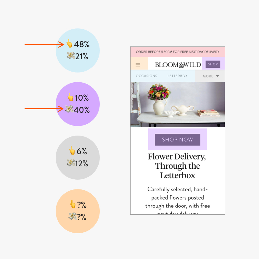
In this example, click through rate is compared with revenue per user (RPV) on different CTA's on the navigation. Although category names perform almost 5x better for click through, the bold 'Shop now' CTA's is 2x better for RPV. The hypothesis here is that each appeal to different types of users — browsers, and focused buyers, or new and returning users.
03
Competitor Research
Sometimes it is useful to survey the landscape around you to see how you measure up against competitors. With this oversight, you can analyse what works and what doesn't and identify gaps in your product offering.
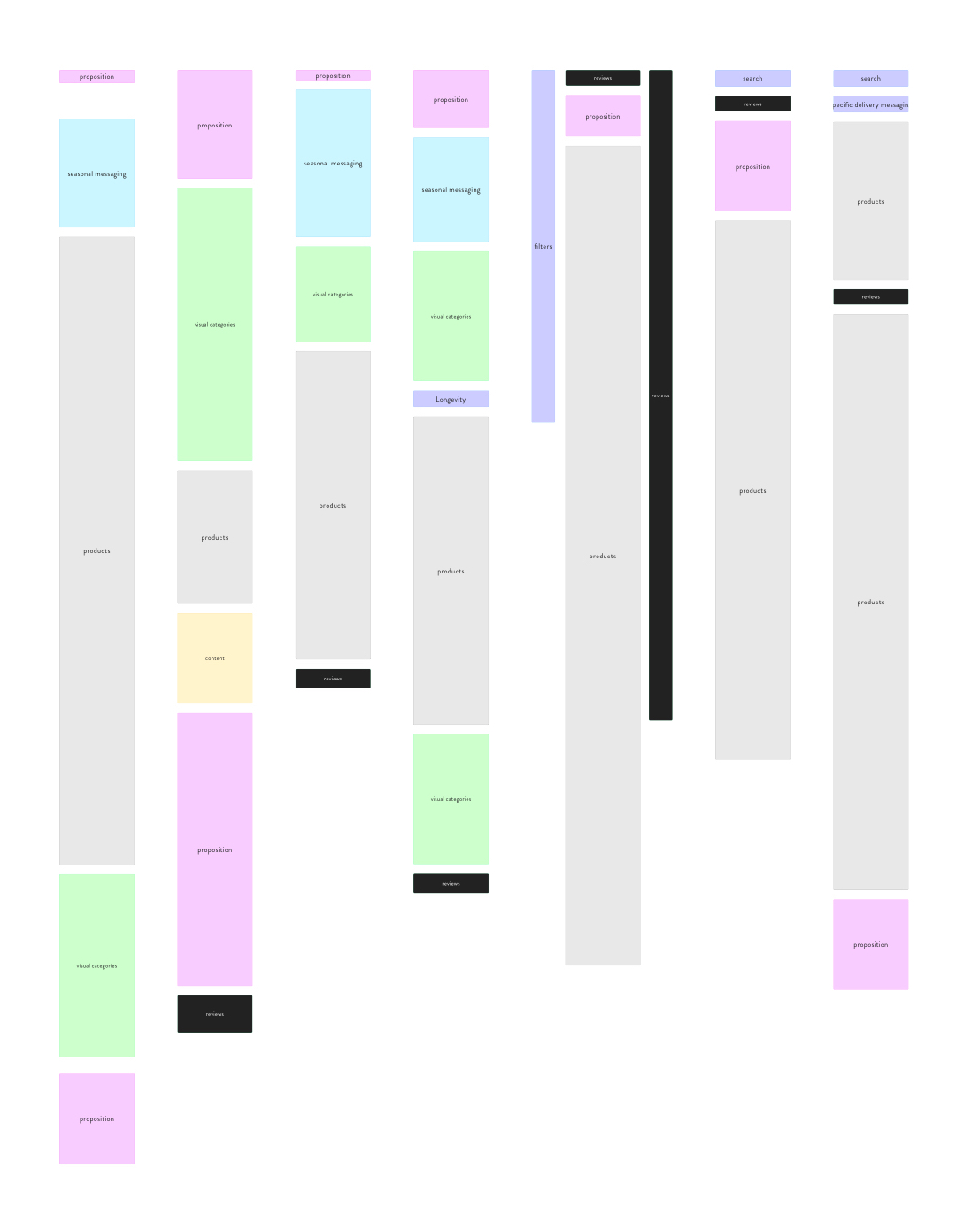
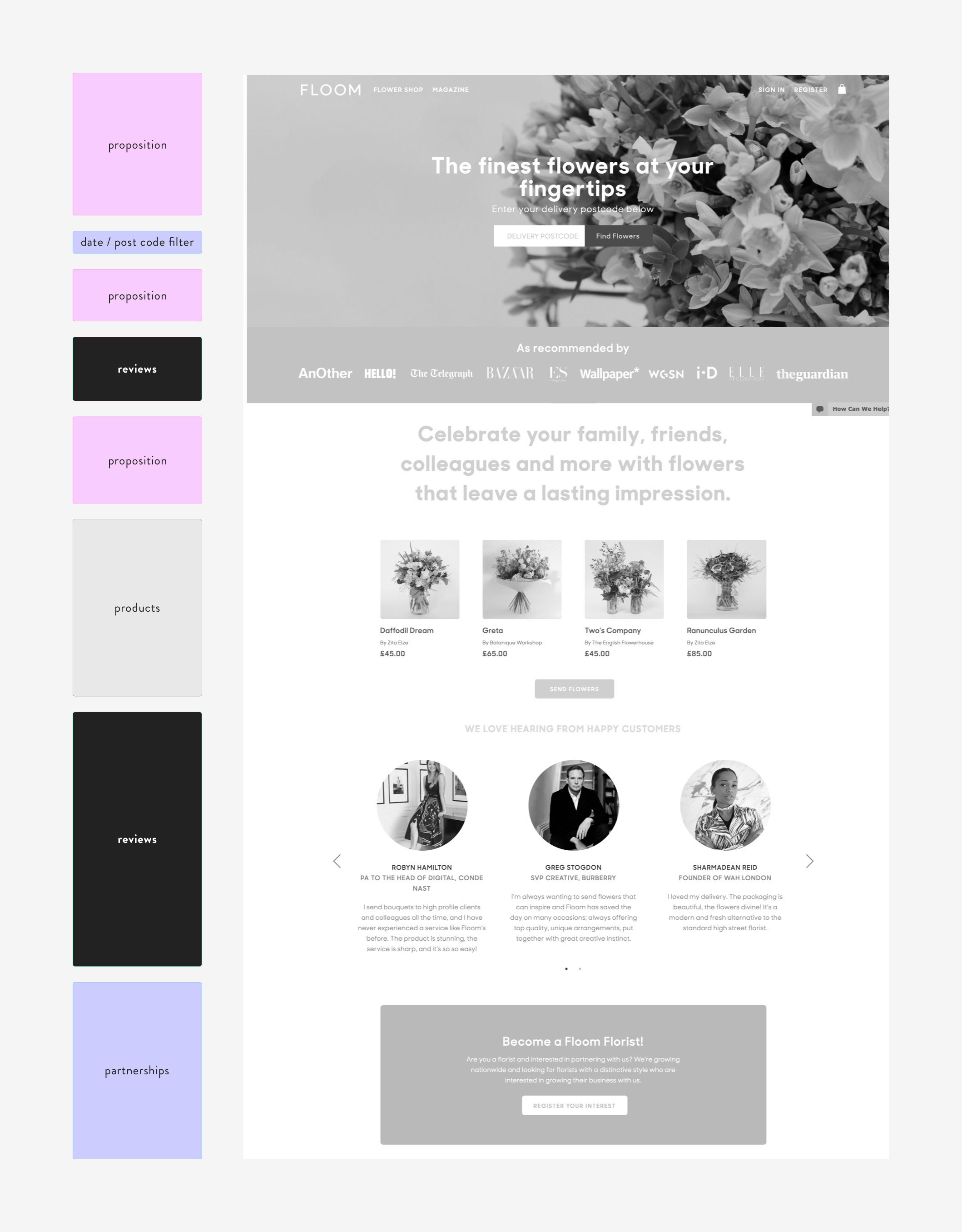
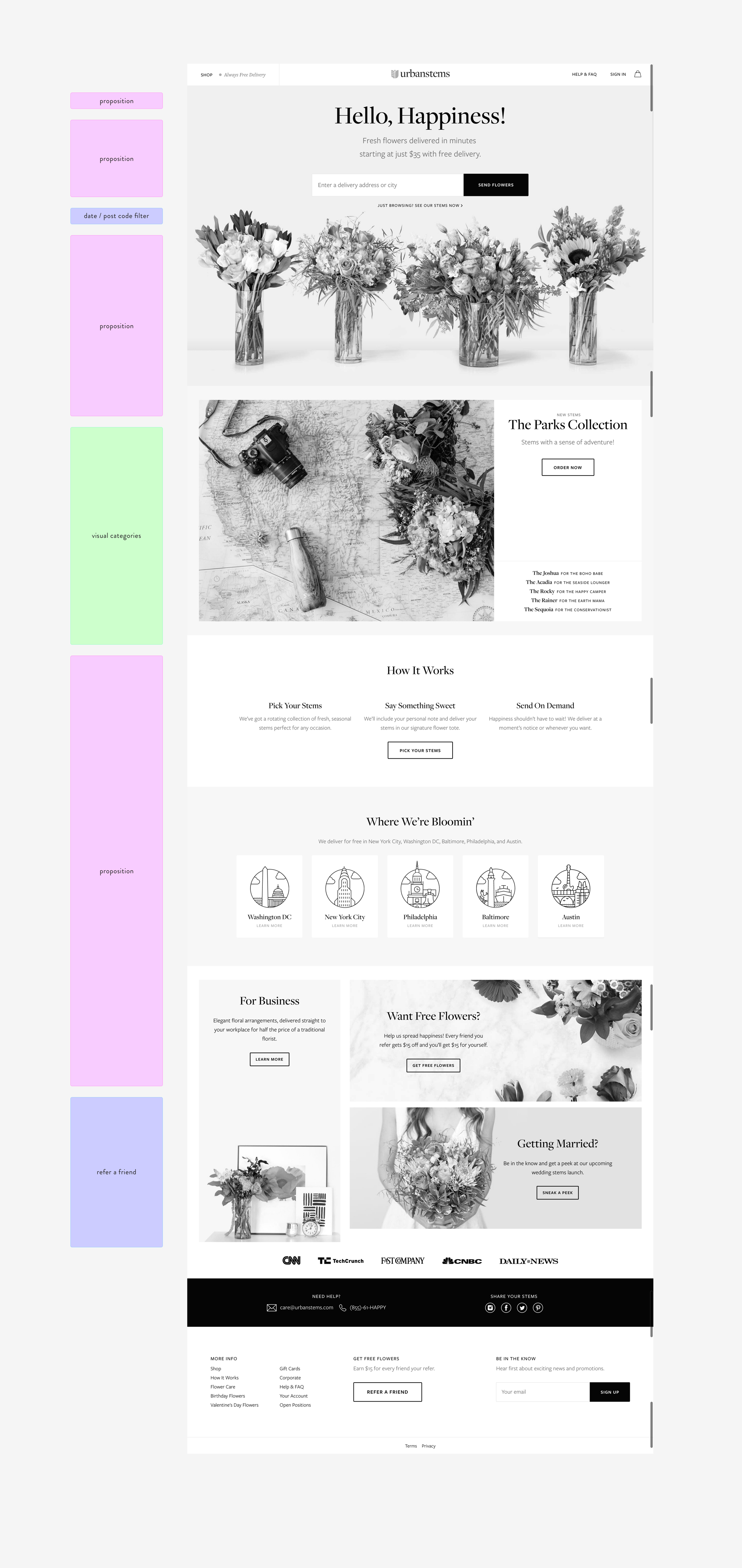
Here is a visual analysis of competitor homepages, with colours representing different types of content. Once the visual maps were made, they were set alongside each other for comparison.
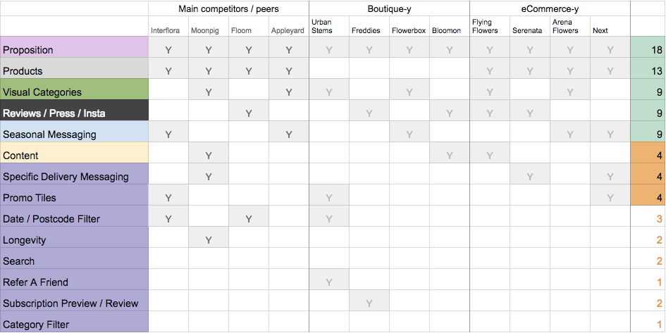
The types of content were then tallied up in a spreadsheet to give a visual and numerical overview of competitors homepages.
The types of content were then tallied up in a spreadsheet to give a visual and numerical overview of competitors homepages.
The types of content were then tallied up in a spreadsheet to give a visual and numerical overview of competitors homepages.
04
Sketching
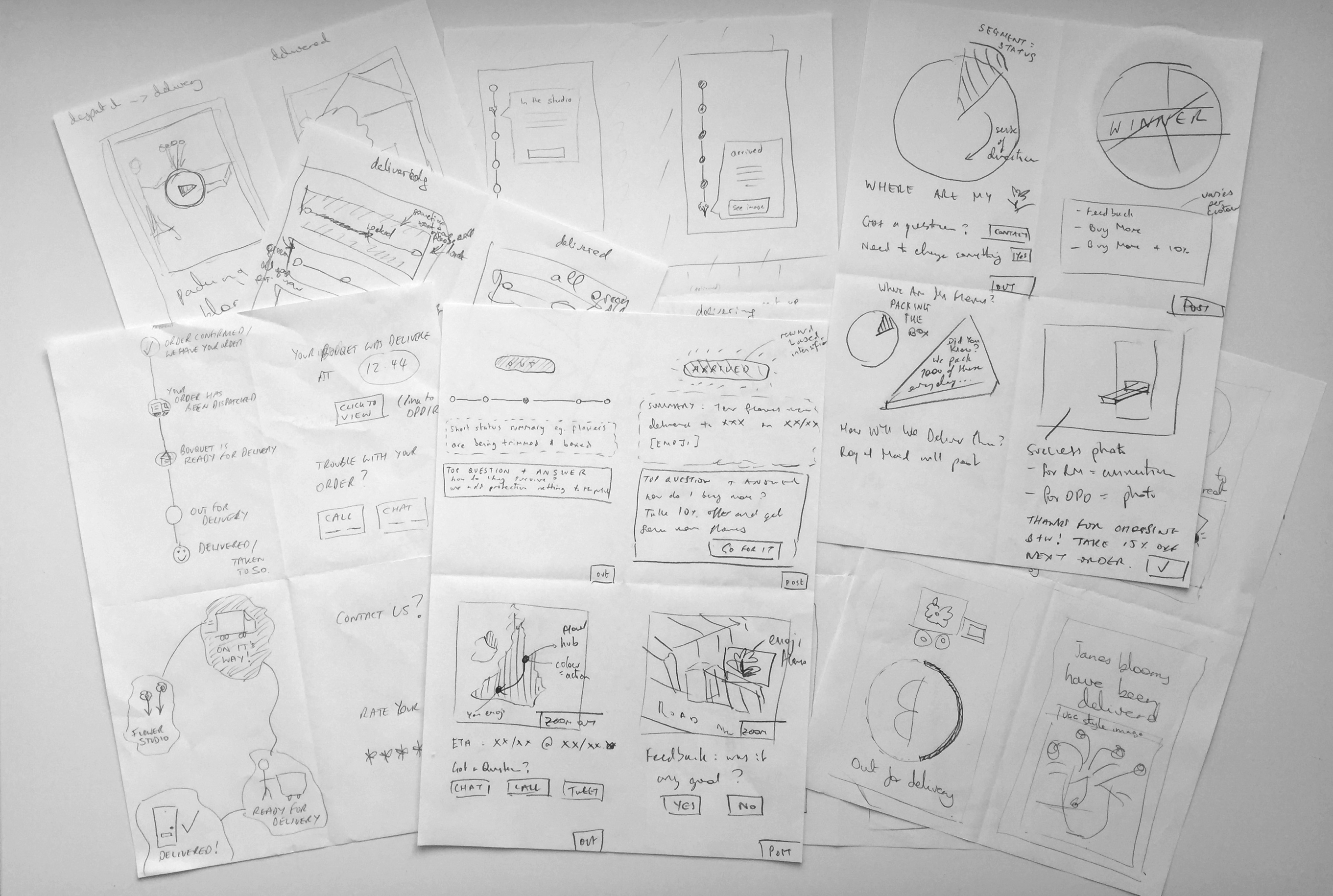
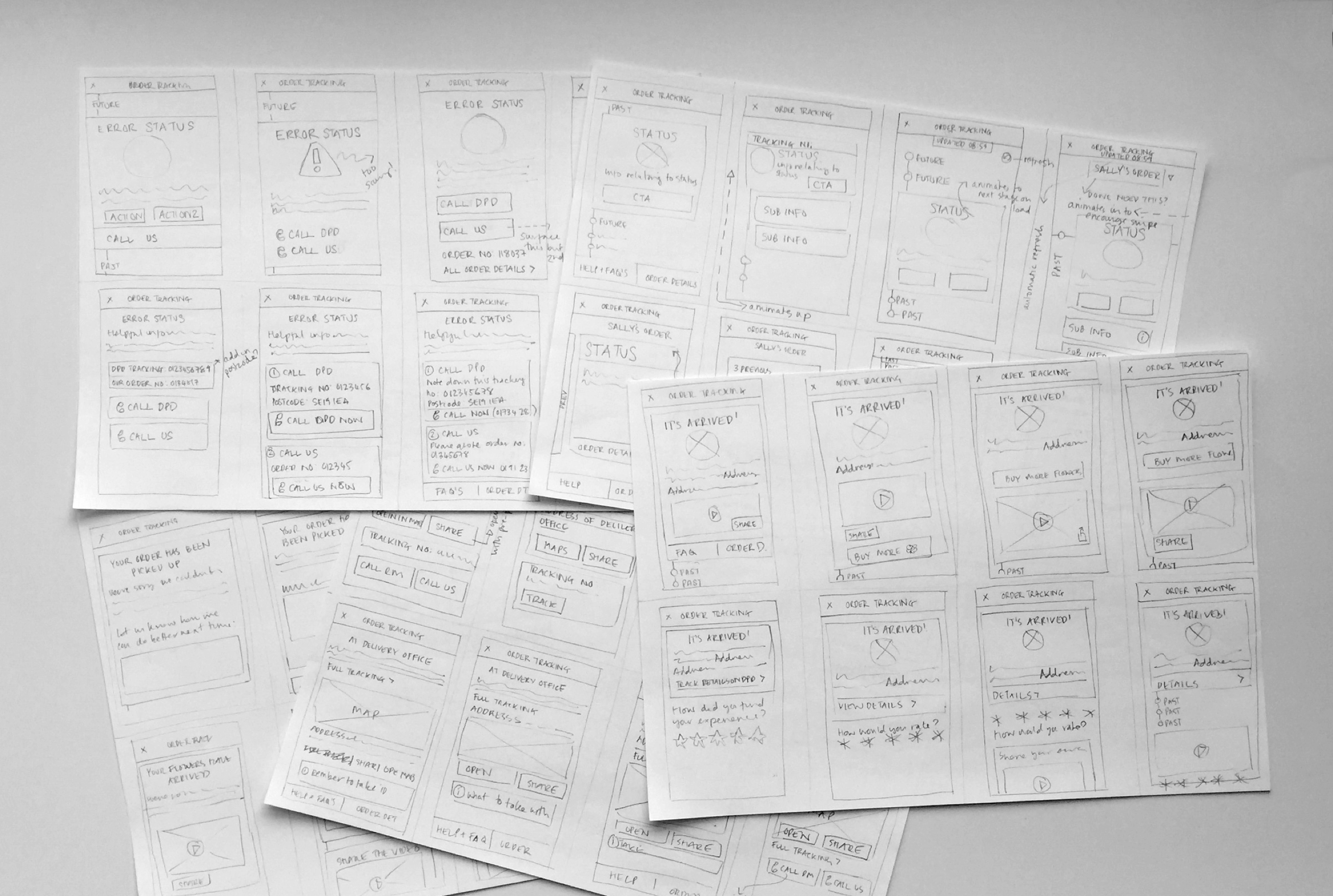
Sketching is a very common part of my process. I like to do crazy eights to quickly ideate, sometimes getting stakeholders involved too. The best ideas I will sometimes take a step further to more detailed sketches too.
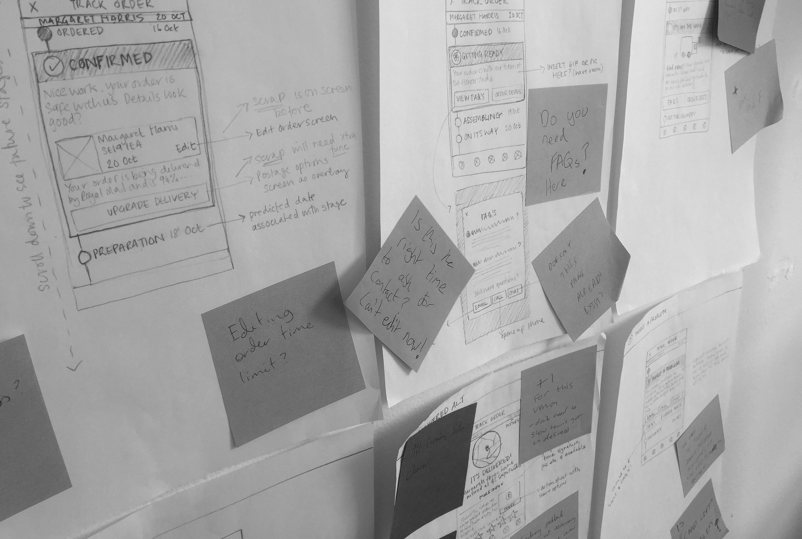
I then pin the sketches up on the wall and invite as many scribbles and notes as possible. The low fidelity medium is great because it encourages lots of feedback.
Sketching is a very common part of my process. I like to do crazy eights to quickly ideate, sometimes getting stakeholders involved too. The best ideas I will sometimes take a step further to more detailed sketches too.
I then pin the sketches up on the wall and invite as many scribbles and notes as possible. The low fidelity medium is great because it encourgaes lots of feedback.
Sketching is a very common part of my process. I like to do crazy eights to quickly ideate, sometimes getting stakeholders involved too. The best ideas I will sometimes take a step further to more detailed sketches too.
I then pin the sketches up on the wall and invite as many scribbles and notes as possible. The low fidelity medium is great because it encourages lots of feedback.

05
UX
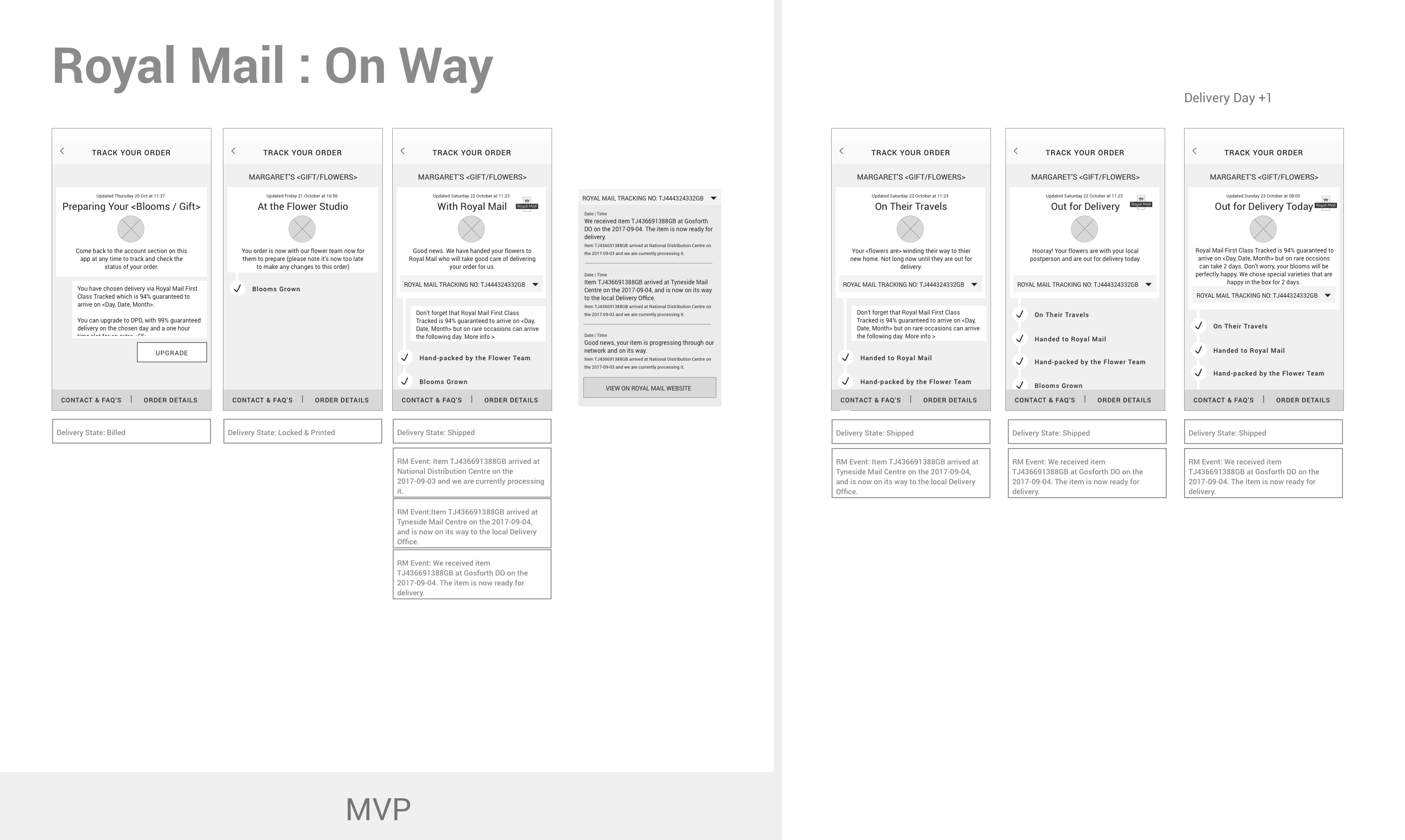
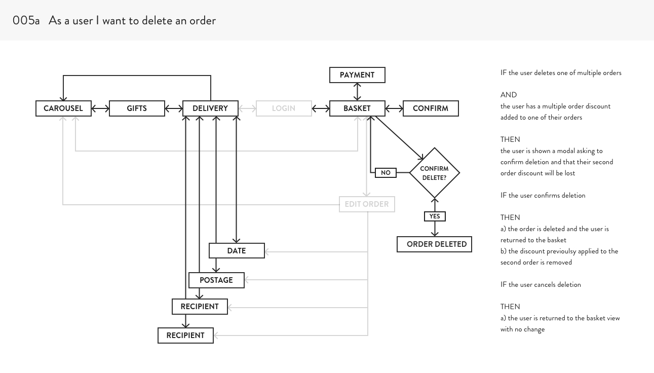
There is a huge range of UX deliverables, each appropriate to different times and scenarios, the ones i use most often are wireframes, sitemaps, user flow diagrams and wireflows.
I love user flow diagrams as a way to work out complex logic flows, and of course wireframes work really well as a stakeholder communication tool.
06
UI Design
I have a background in Fine Art so UI design was a natural first step for me after my MA in Communication Design. Whilst I now consider myself a hybrid UI & UX designer, there is a special place in my heart for perfectly set type, colour, generous spacing and simple, clean and spacious layout.
Re-design of a healthy food delivery start-up. The modern yet seventies inspired serif combined with clean, natural colours compliment the food photography and add a touch of playfulness.
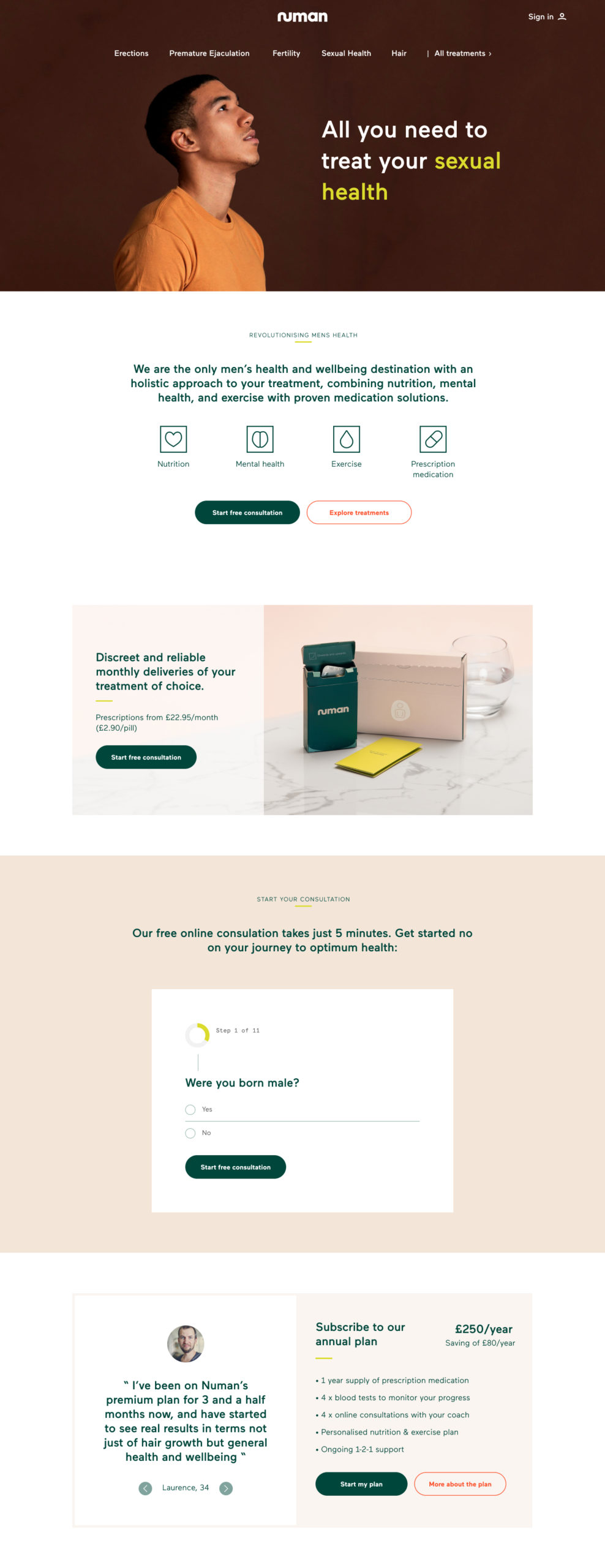
(Below) Re-design of men's health startup Numan's homepage. Including art direction of the product photography and icon design.
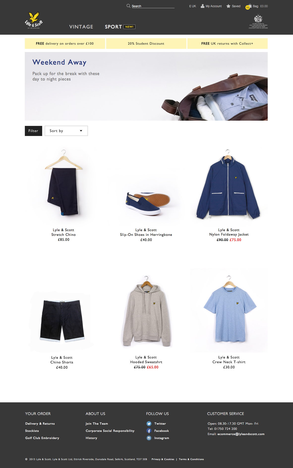
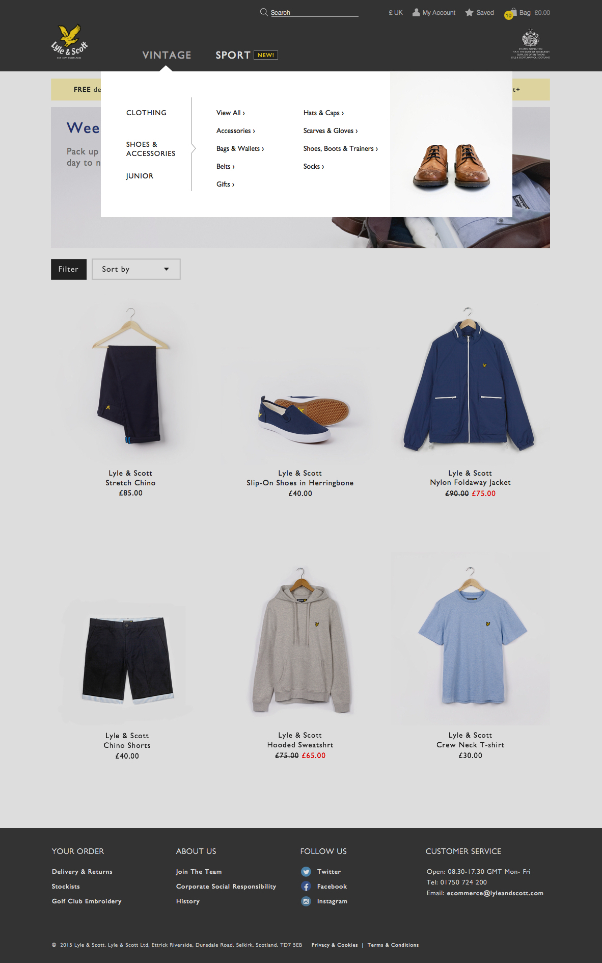
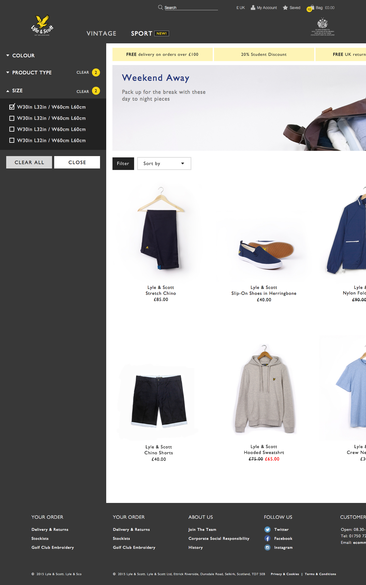
Product listing page for menswear brand Lyle & Scott. In addition to UI & UX design, I art directed the promotional and product photography to help elevate the iconic streetwear brand to a more grown up, dapper aesthetic.
Product listing page for menswear brand Lyle & Scott. In addition to UI & UX design, I art directed the promotional and product photography to help elevate the iconic streetwear brand to a more grown up, dapper aesthetic.
07
Design Systems
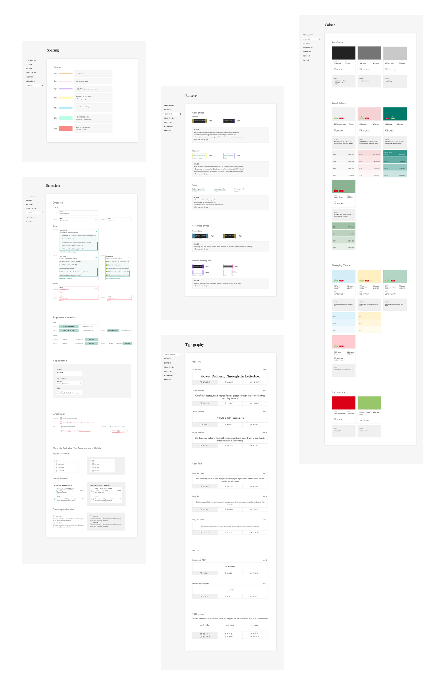
I have a very systematic approach to a lot of things, so design systems were a natural draw for me from the moment they started being talked about. I have been responsible for creating and maintaining the design system in most of my roles and believe they are indispensable in speeding up design as well as development processes.
The dream one day is to build a living design system that exports and updates direct to code..!
08
Prototyping
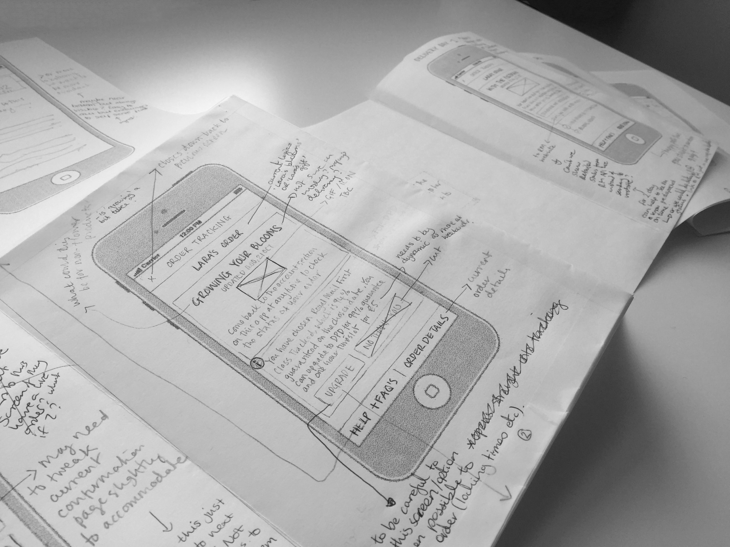
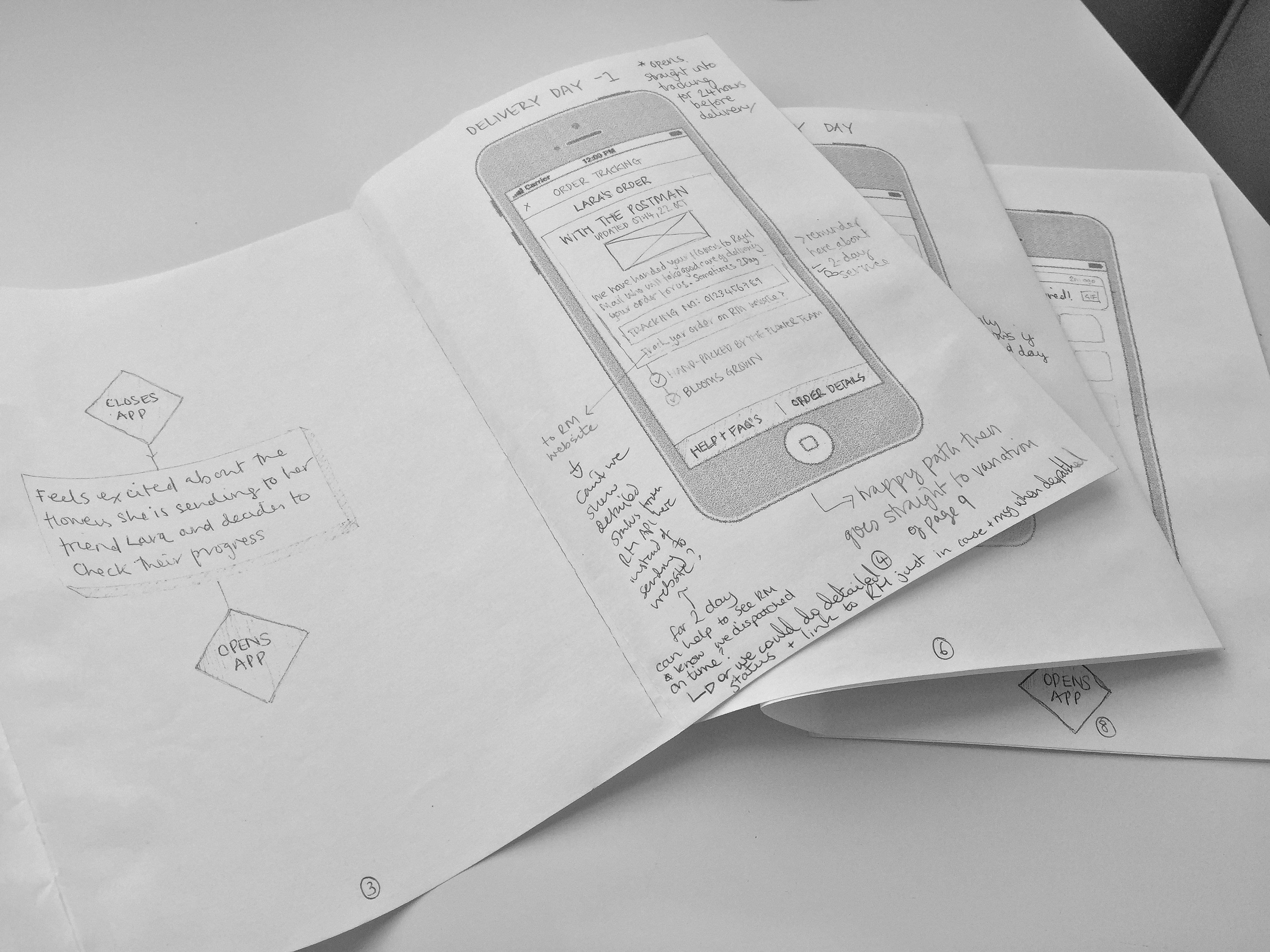
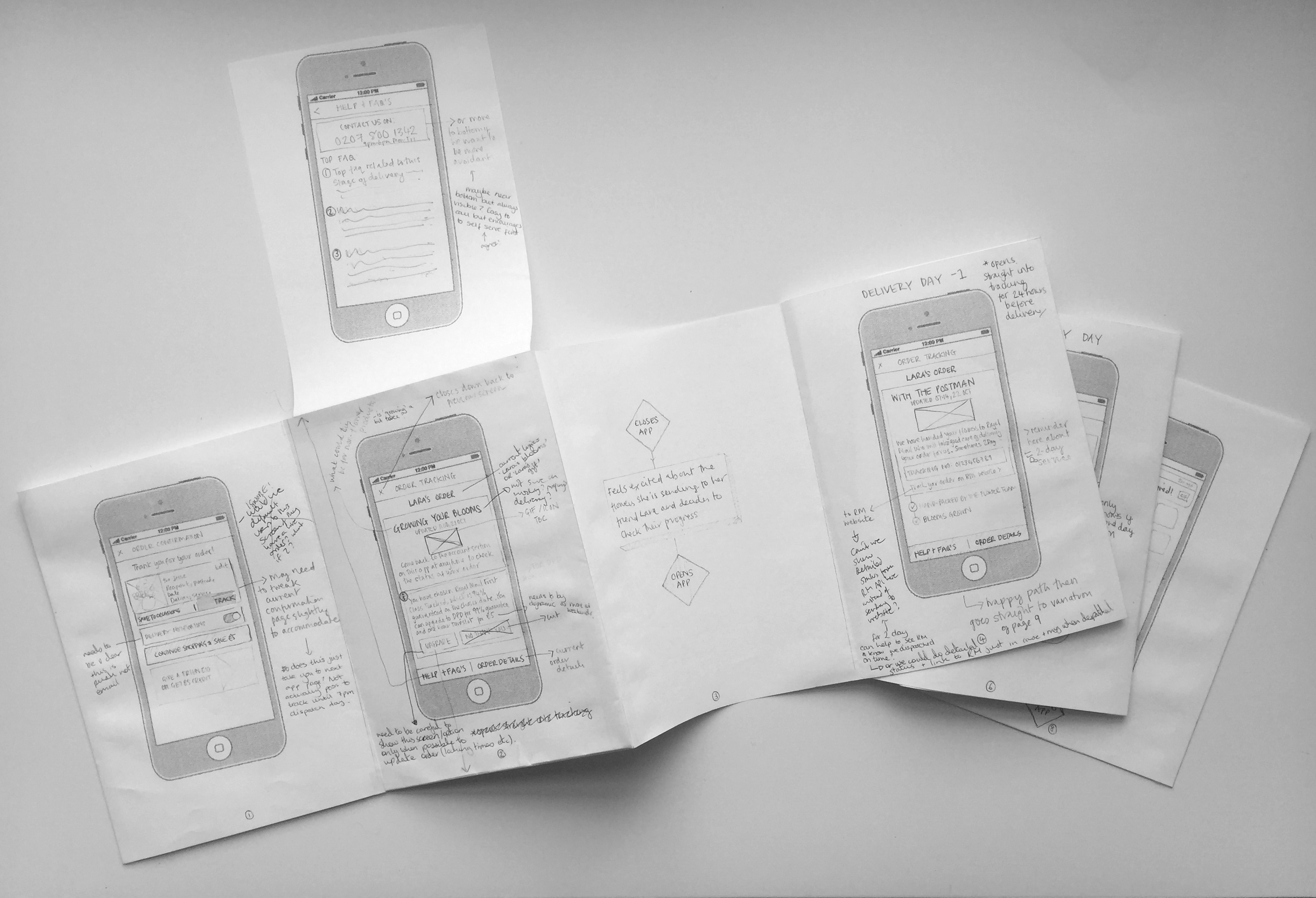
Sketched paper prototypes are a fun, tactile and low commitment way to get feedback from stakeholders and tend to invite lots of discussions.
Sketched paper prototypes are a fun, tactile and low commitment way to get feedback from stakeholders and tend to invite lots of discussions.
I really enjoy bringing something to life with animation and sometimes even getting my hands into a bit of code in the process. I have worked with Framer (CoffeeScript), Origami, Principle, and of course flow based interaction tools like InVision and Marvel.
The below prototype for a survey creation tool was made in Origami and had real working input fields.
I really enjoy bringing something to life with animation and sometimes even getting my hands into a bit of code in the process. I have worked with Framer (CoffeeScript), Origami, Principle, and of course flow based interaction tools like InVision and Marvel.
The above prototype for a survey creation tool was made in Origami and had real working input fields.
View another project
My ProcessProject type
New CoProduct Design & Art Direction
Bloom & WildProduct Design
AttestProduct Design
MR PORTERProduct Design
ASOSProduct Design
On DeckProject type
