
Translucent was building intercompany accounting software — a category with no established UX playbook. Finance teams were managing complex multi-entity, multi-currency transactions across disparate systems, reconciling them by hand in spreadsheets. I joined as founding designer and over 15 months built the brand, the product, and the design system that underpinned it all. The scope was total.
Since there were no reference products I went straight to the source: running 1:1 sessions directly with the finance professionals who would use the product — accountants who understood the complexities of multi-entity accounting in a way that I didn't. What did their actual workflow look like, where were the failure points?
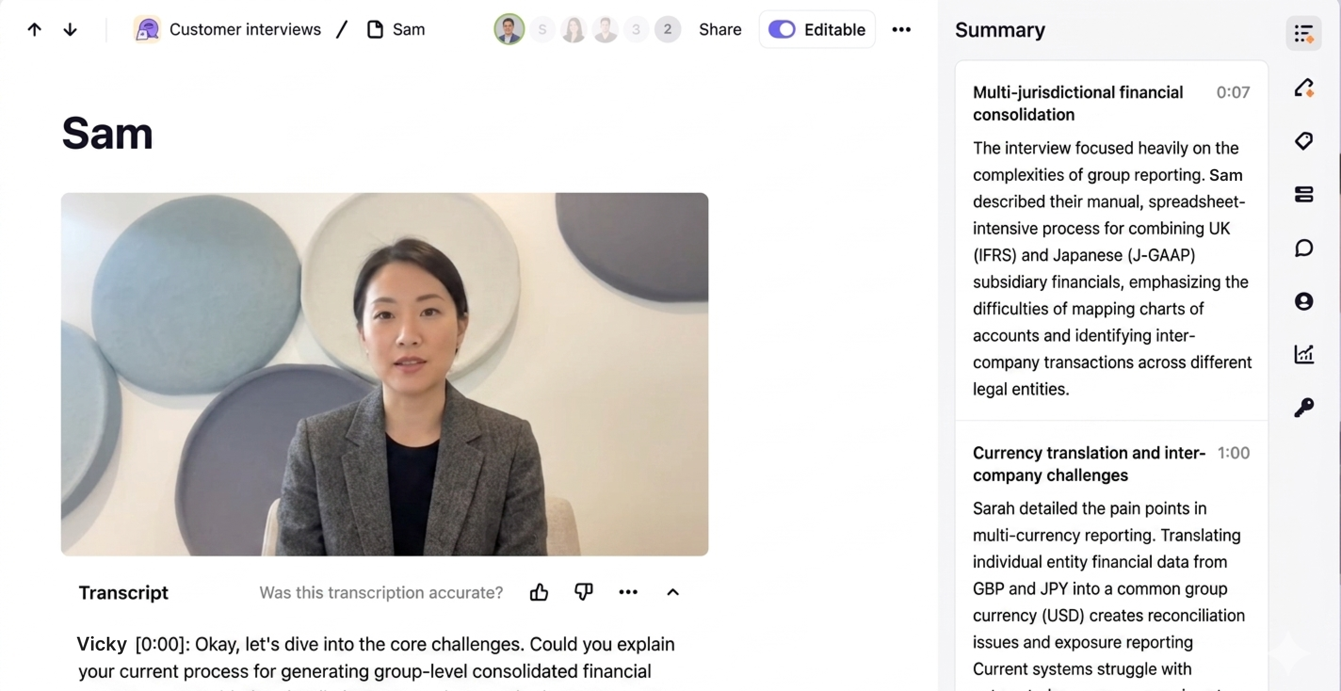
What emerged was a clear pattern: existing tools imposed a structure that didn't fit how multi-entity accounting actually worked. Users had adapted around them, building fragile workarounds to compensate. The design challenge wasn't to improve those workflows — it was to start from scratch and design around them.
With a tight delivery schedule and an engineering team ready to build, brand and product work ran simultaneously. The brand had to feel credible to finance professionals — structured, considered, not flashy — while signalling that this was a new kind of tool in a category that had historically been grim to use.
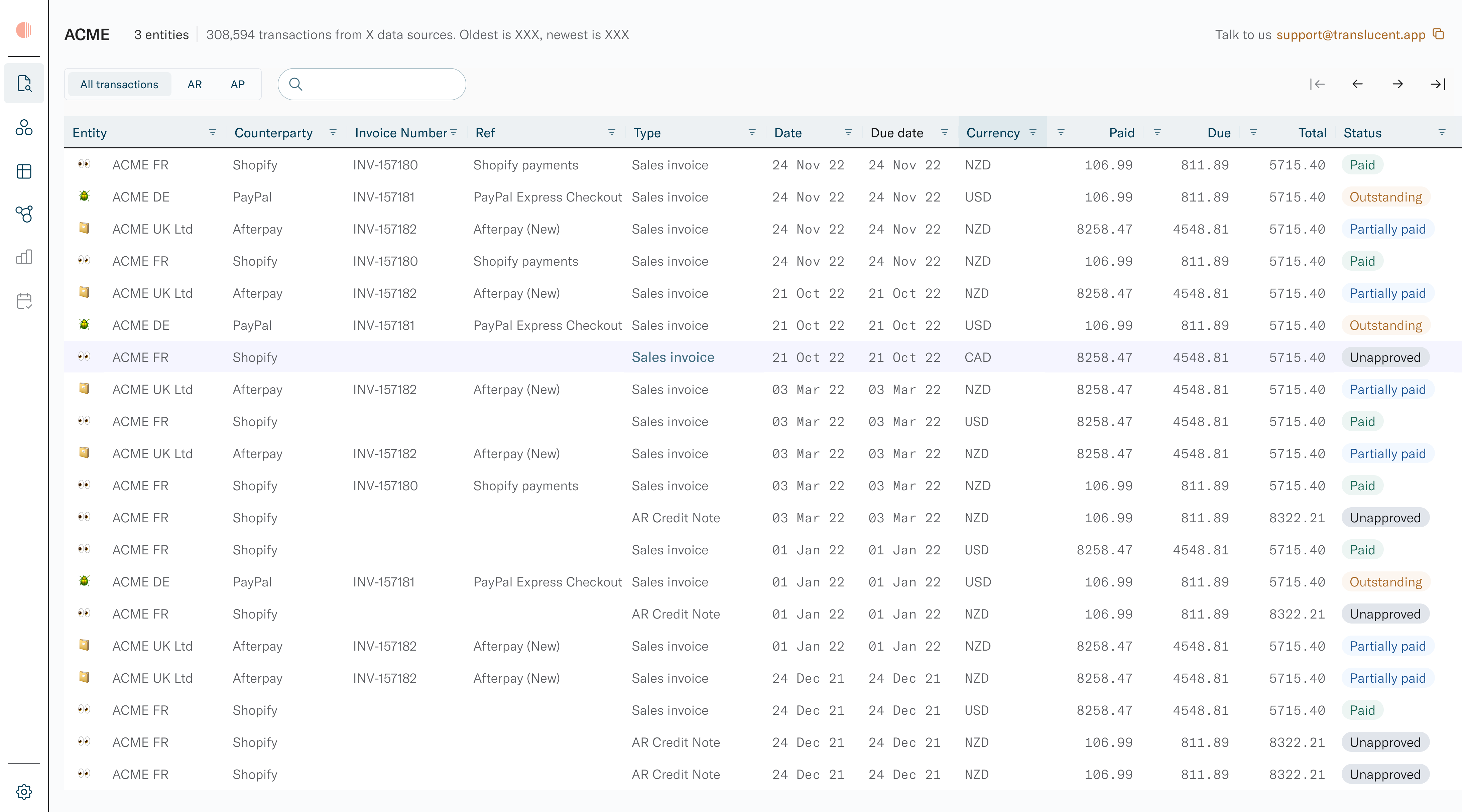
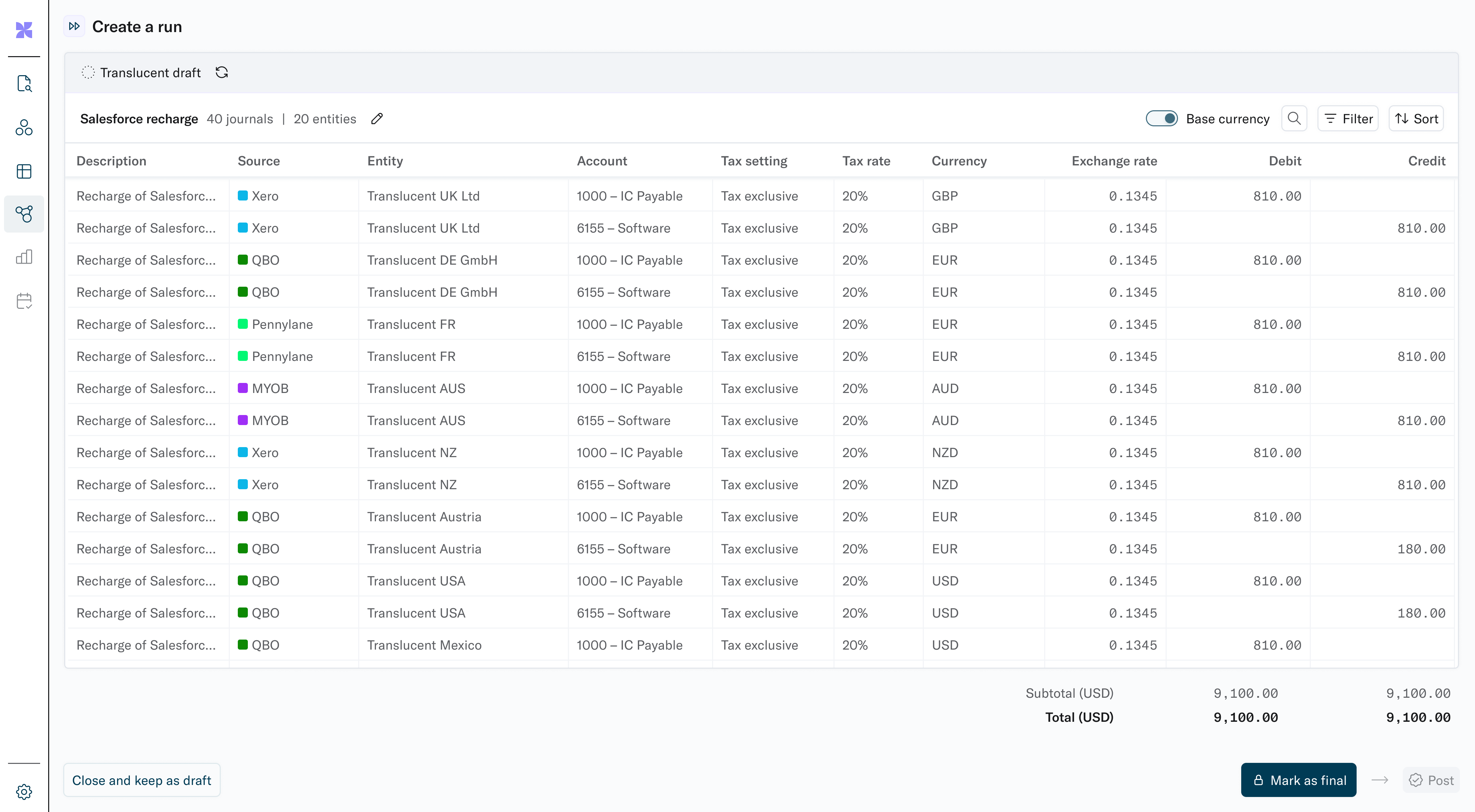
The product itself required designing for high-density structured data — entities, accounts, currencies, exchange rates, debit/credit columns — without losing legibility.
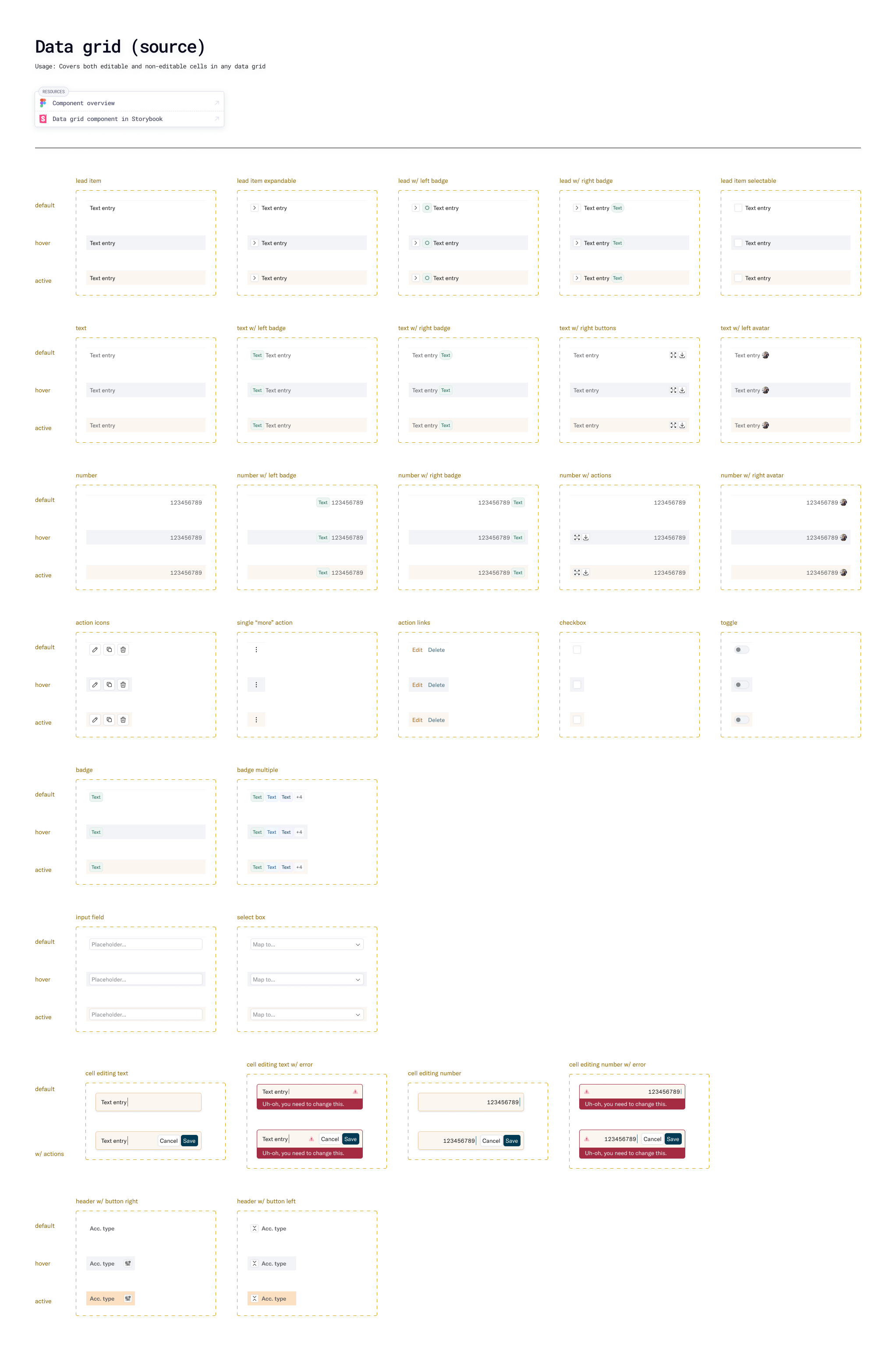
Speed was non-negotiable. I was a strong advocate for tokens and worked closely with the engineering team to establish a tokenised design system — colour, spacing, typography, and component states defined once and referenced everywhere. This way, the system could adapt and extend as the product grew and branding evolved rather than needing to be defined at the outset.
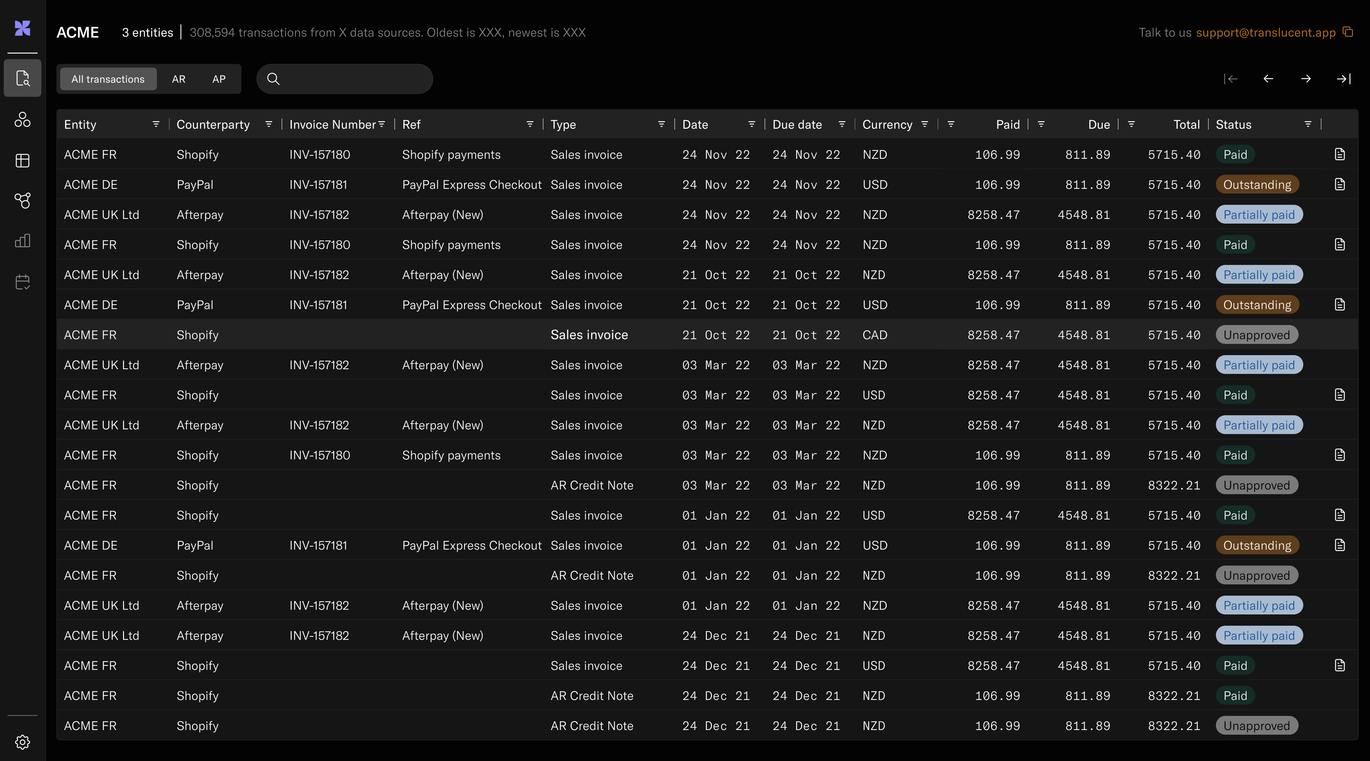
The data grid was one component that evolved significantly as the product grew, and as more use cases arose. Keeping the design and code aligned, via close collaboration with the engineering team, was key to shipping fast and avoiding design debt building.
Fifteen months. Brand, research, product, and system — built from nothing, shipped and in use. The work was demanding and novel: no tech, no product, no design templates to follow, no incumbents to learn from. Just a domain crying out for better user experience.
Protected images
Enter the password to view the product screenshots.