My Role:
UI Designer
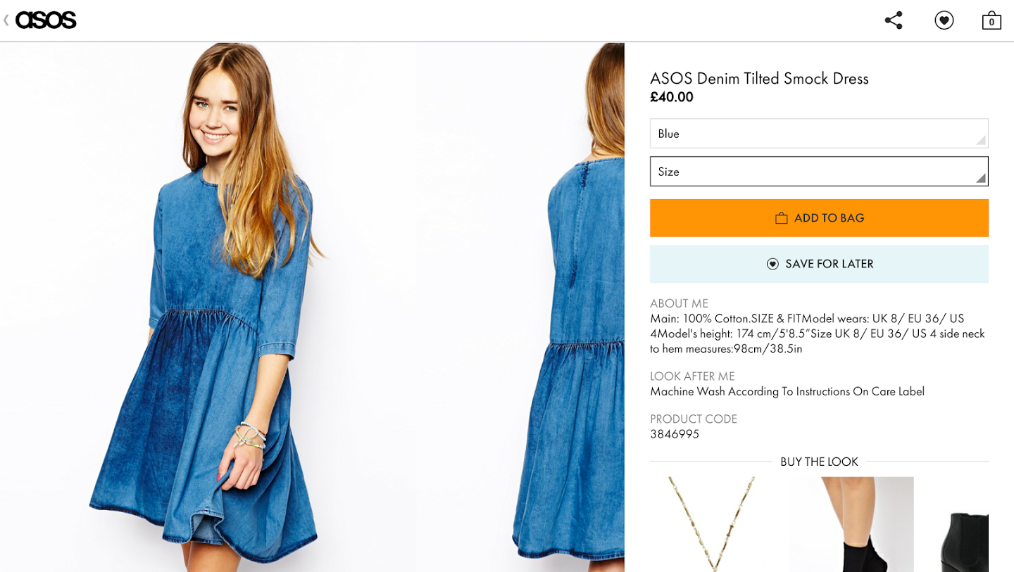
I led the UI Design for the ASOS Android app, plus a number of other projects across responsive web and iOS
Android App
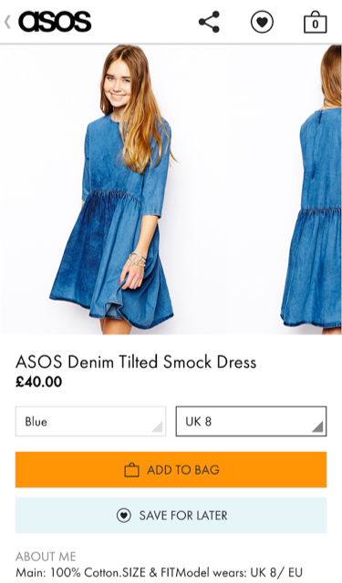
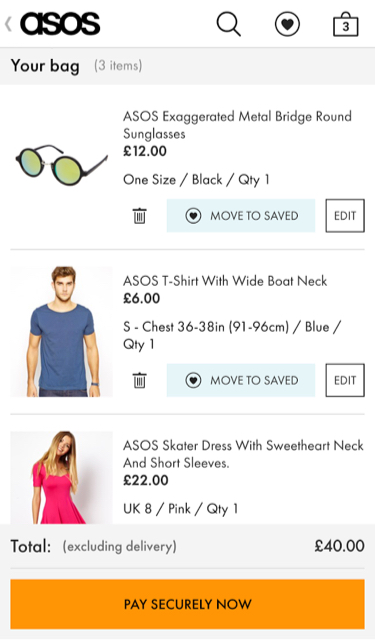
The ASOS Android app was seeing a 3% rise in traffic month on month, yet the design was seriously lagging behind the iOS app. The new design needed to be in line with the iOS experience but at the same time be unique and accommodating of the platform specific conventions of Android. The re-design was featured on the Play Store, causing traffic to rise by 12% whilst conversion doubled to 8%.
The ASOS Android app was seeing a 3% rise in traffic month on month, yet the design was seriously lagging behind the iOS app. The new design needed to be in line with the iOS experience but at the same time be unique and accommodating of the platform specific conventions of Android.
Personal Stylist
One of the major challenges that a brand like ASOS faces is how to enable users to find the perfect product within a huge range of possible options. A search for 'black dress' can regularly return thousands of results.
One approach to this was to offer 'Personal Stylists' — influencers drawn from Instagram or the blogging world, each with their own unique sense of style. Users could view their profile before starting up a live chat with them.
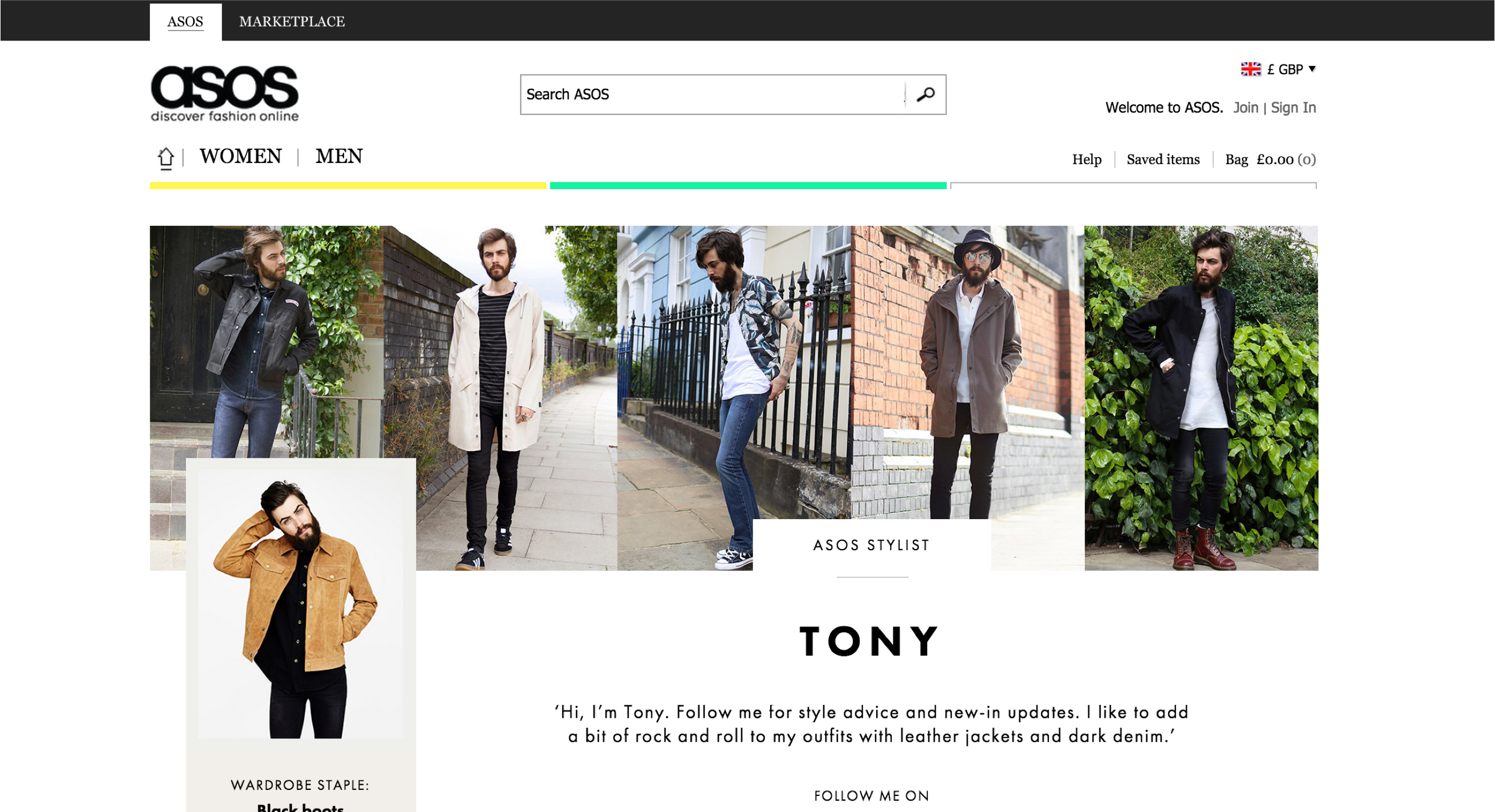
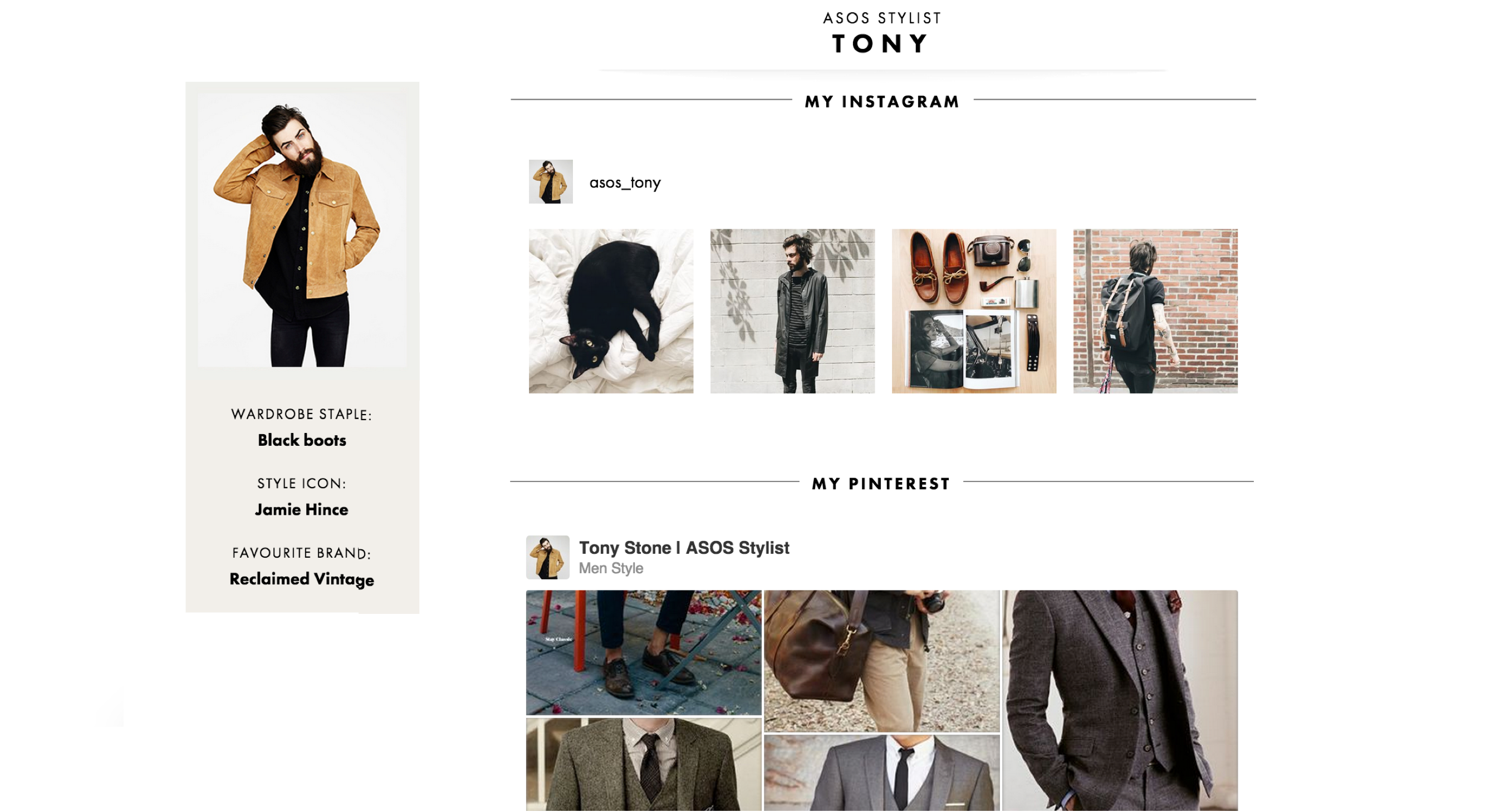
Each stylist had their own profile page which pulled in all their social channels. Users could also shop directly from their looks and weekly product picks on this page.
Each stylist had their own profile page which pulled in all their social channels. Users could also shop directly from their looks and weekly product picks on this page.
The Canvas
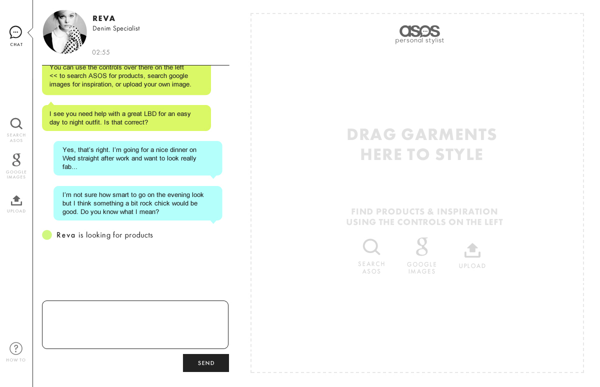
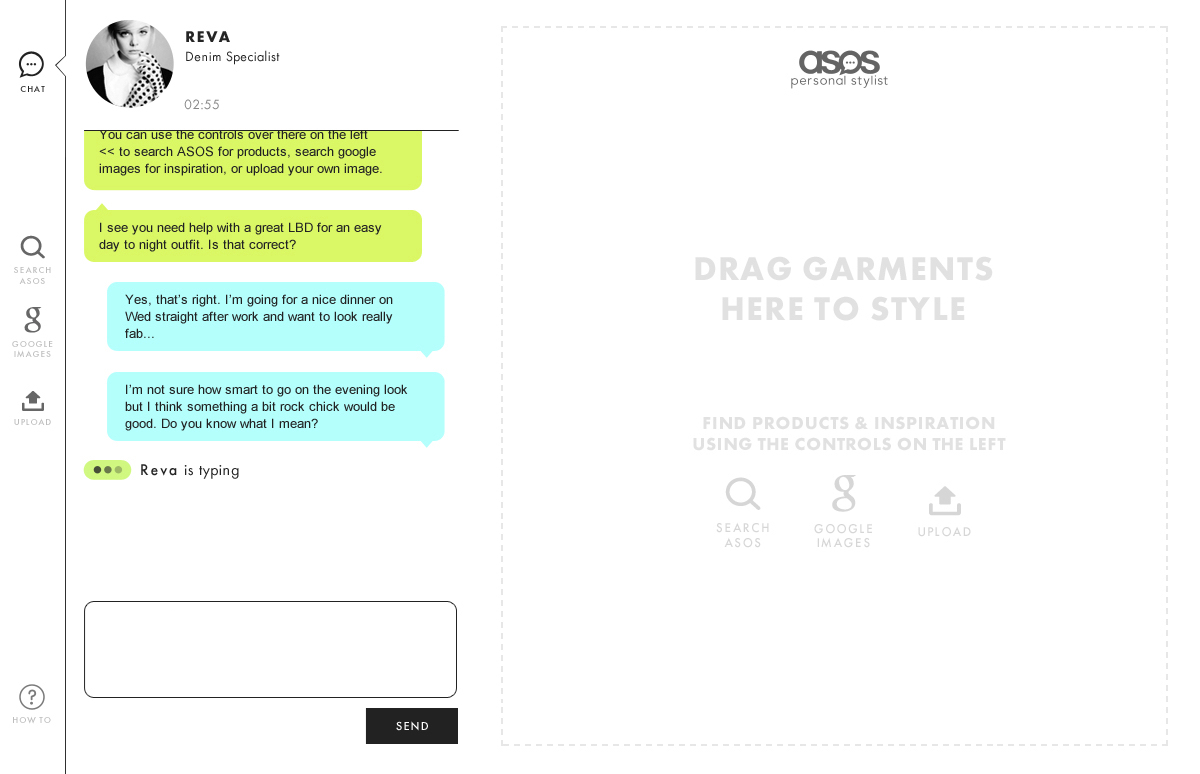
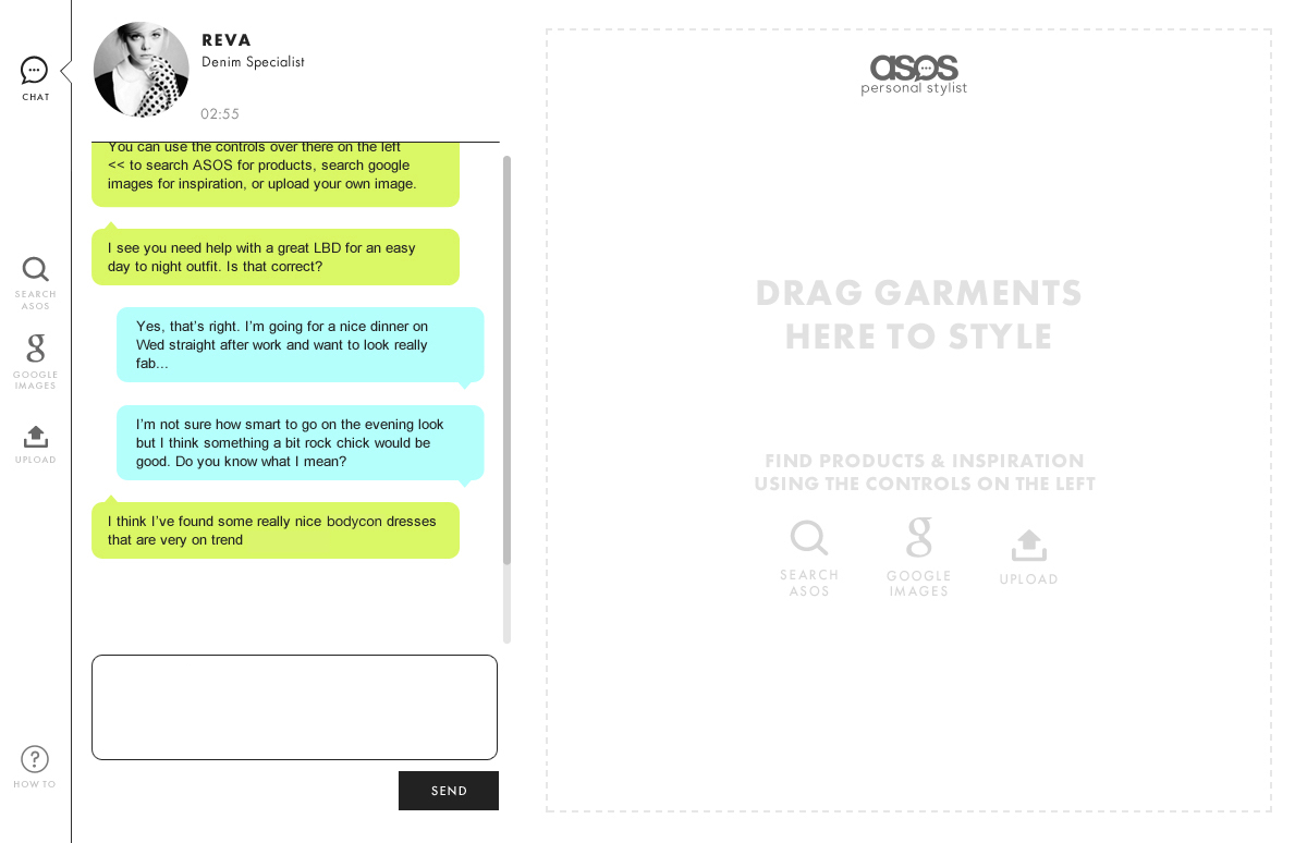
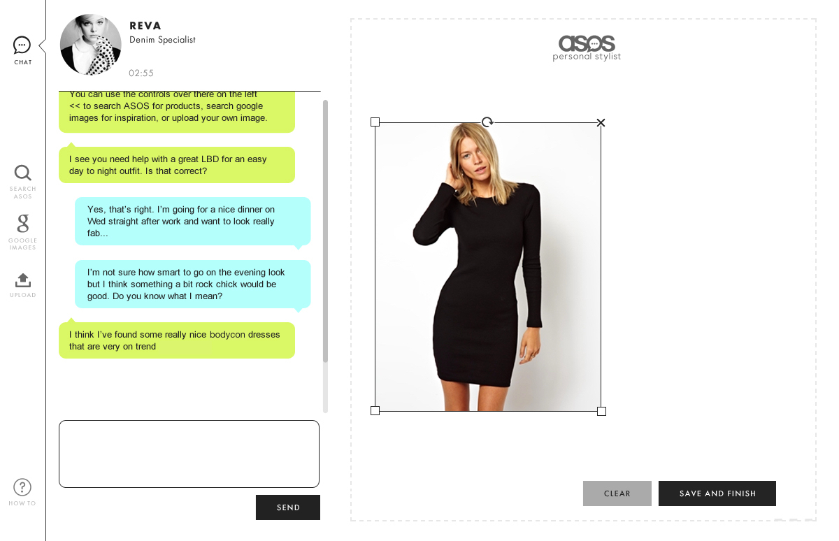
A collaborative moodboard enabled the user and stylist to share ideas and visual inspiration and put outfits together. Users could then go on to buy the products they liked directly from the moodboard.
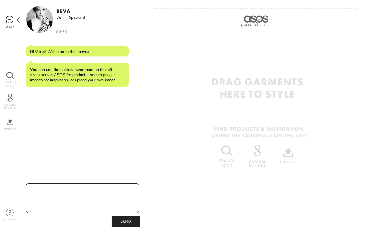


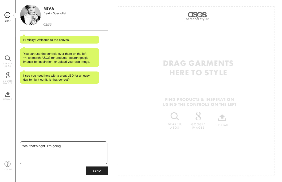
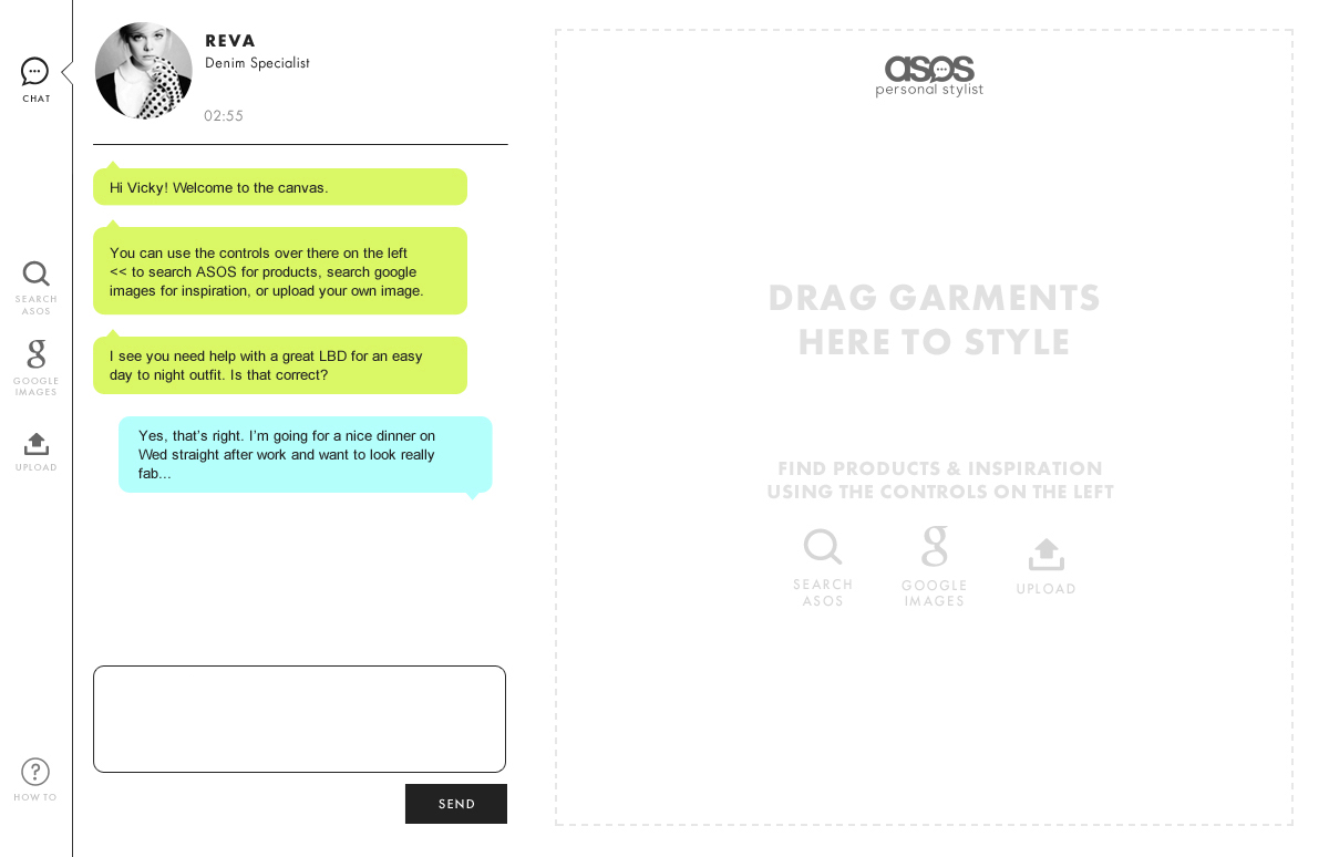
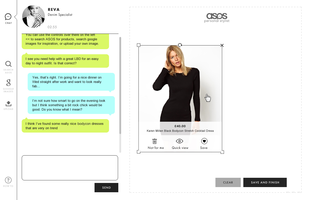

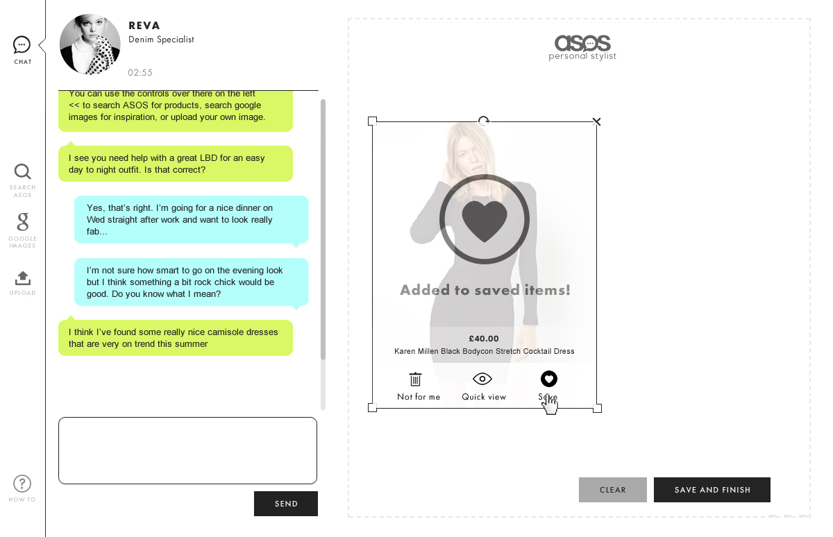

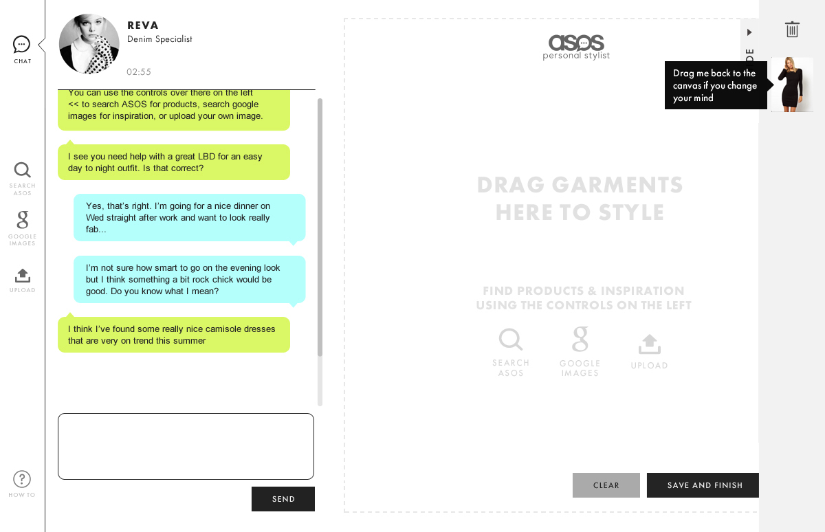
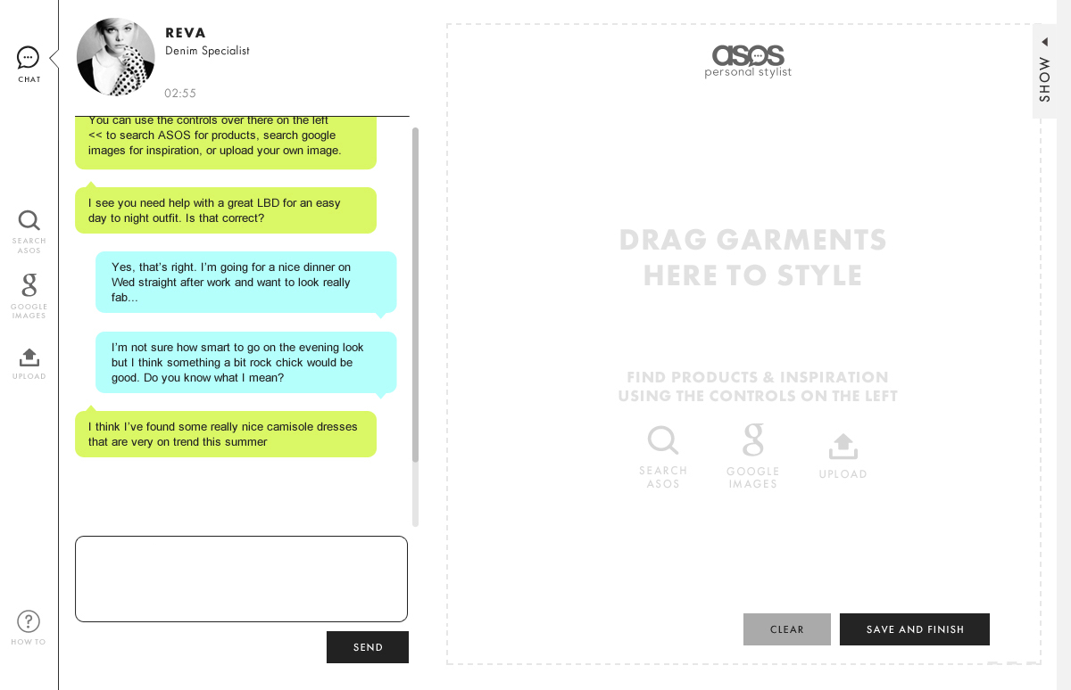
Adherence to the Android design guidelines (pre-material) meant that users could navigate their way around the app with confidence. Whilst Personal Stylists helped customers find their style, and their way though the myriad of options available to them.
Project successes:
Conversion after Android re-design
+4%
Personal Stylist revenue (first month)
£230,000
View another project
My ProcessProject type
New CoProduct Design & Art Direction

Bloom & WildProduct Design
AttestProduct Design
MR PORTERProduct Design
ASOSProduct Design

On DeckProject type
