My Role:
Lead Product Designer
(UI/UX) & Art Direction
My Role
UI Design
UX Design
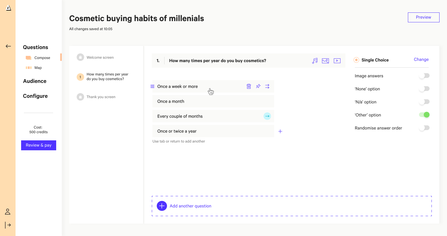
Whilst being heavily involved in strategy, setting up design ops and recruitment, my design time at Attest focused on re-imagining the core product flow: creating a survey.
Survey Creation Re-design
Flower Journal
The existing survey creation flow had become bloated. Months and month of squeezing in extra functionality here and there meant that the existing design was overcrowded and unable to accommodate upcoming features.
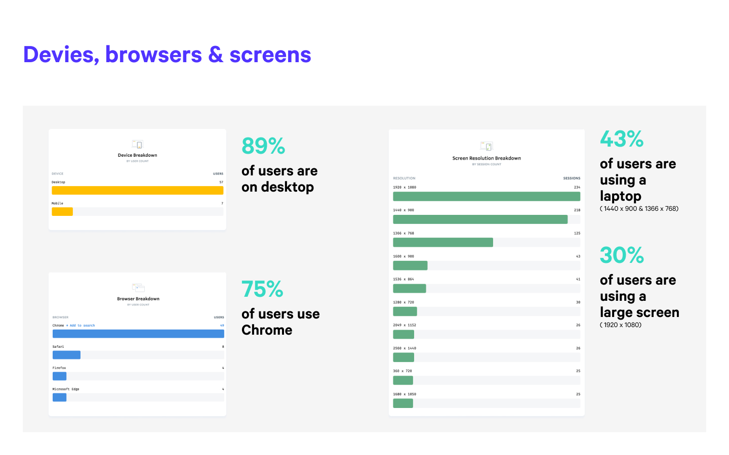
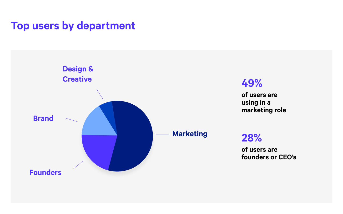
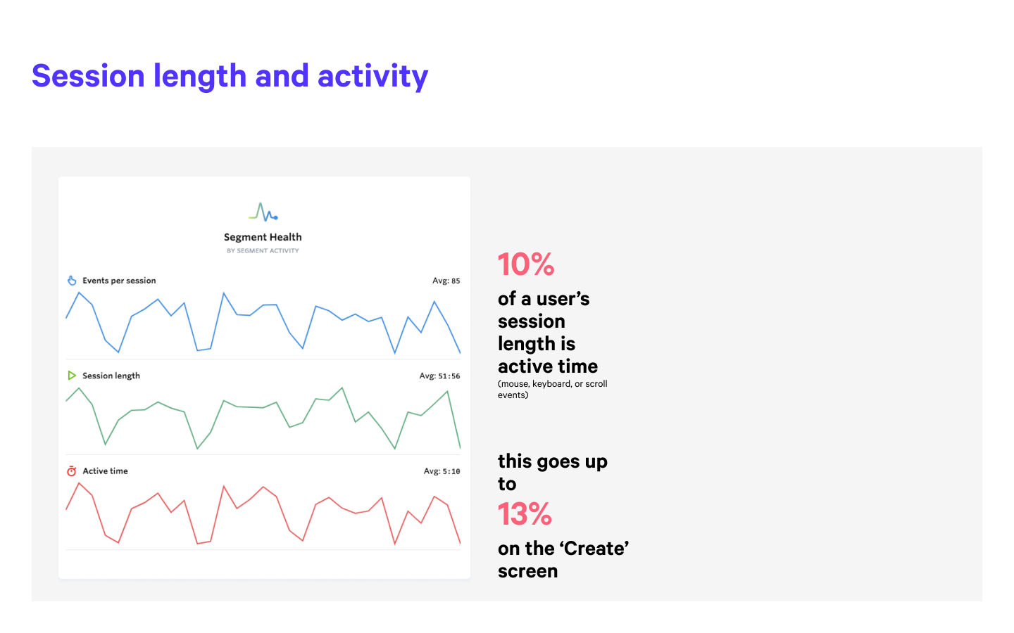
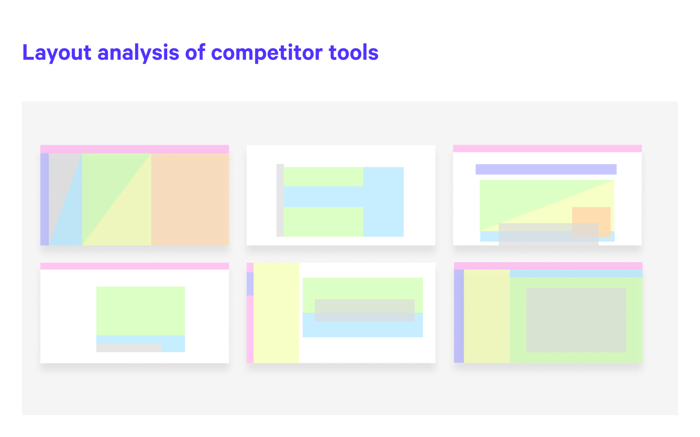
After looking at the data, (quantitative insight from Mixpanel, plus user sessions from FullStory) and talking to internal stakeholders from marketing to development, it became clear there were some common areas of concern.
The existing Bloom & Wild blog was proving not fit for purpose. Less than 1% of visitors to the site included a blog page in their journey and of those that landed on a blog page the conversion rate was very low.
In addition there were problems with the design — modules were not adapting well to different viewport sizes, and the design did not feel as premium and considered as the content it was housing.
The existing survey creation flow had become bloated. Months and month of squeezing in extra functionality here and there meant that the existing design was overcrowded and unable to accommodate upcoming features.
After looking at the data, (quantitative insight from Mixpanel, plus user sessions from FullStory) and talking to internal stakeholders from marketing to development, it became clear there were some common areas of concern.
I held 1-2-1 ideation sessions with the most engaged members of the company, from there sketching out 3 possible approaches, before settling on one single approach which I would work up into a prototype to take out to users.
I held 1-2-1 ideation sessions with the most engaged members of the company, from there sketching out 3 possible approaches, before settling on one single approach which I would work up into a prototype to take out to users.
I held 1-2-1 ideation sessions with the most engaged members of the company, from there sketching out 3 possible approaches, before settling on one single approach which I would work up into a prototype to take out to users.
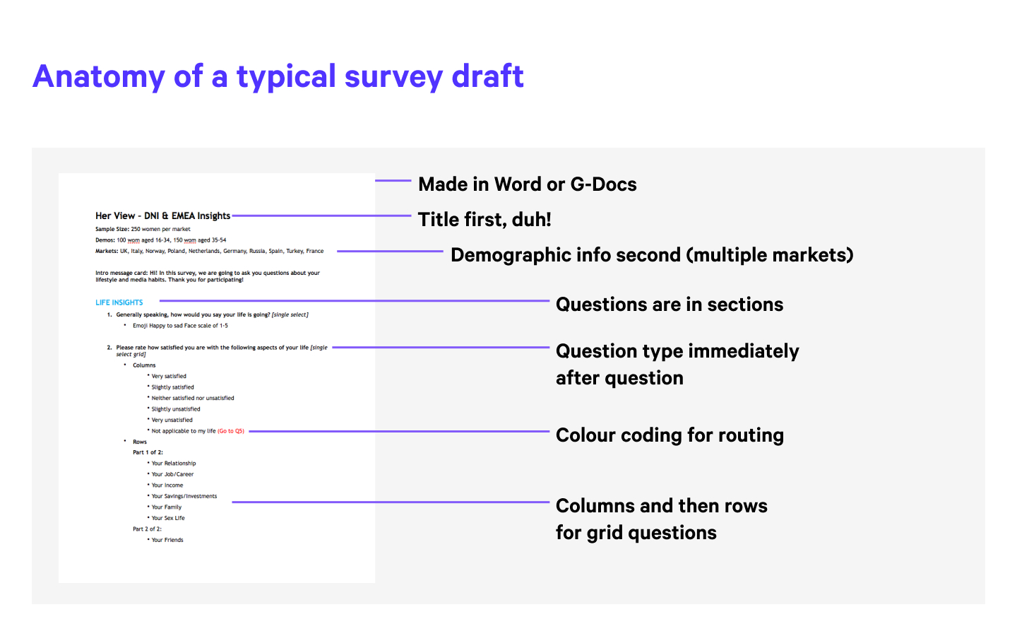
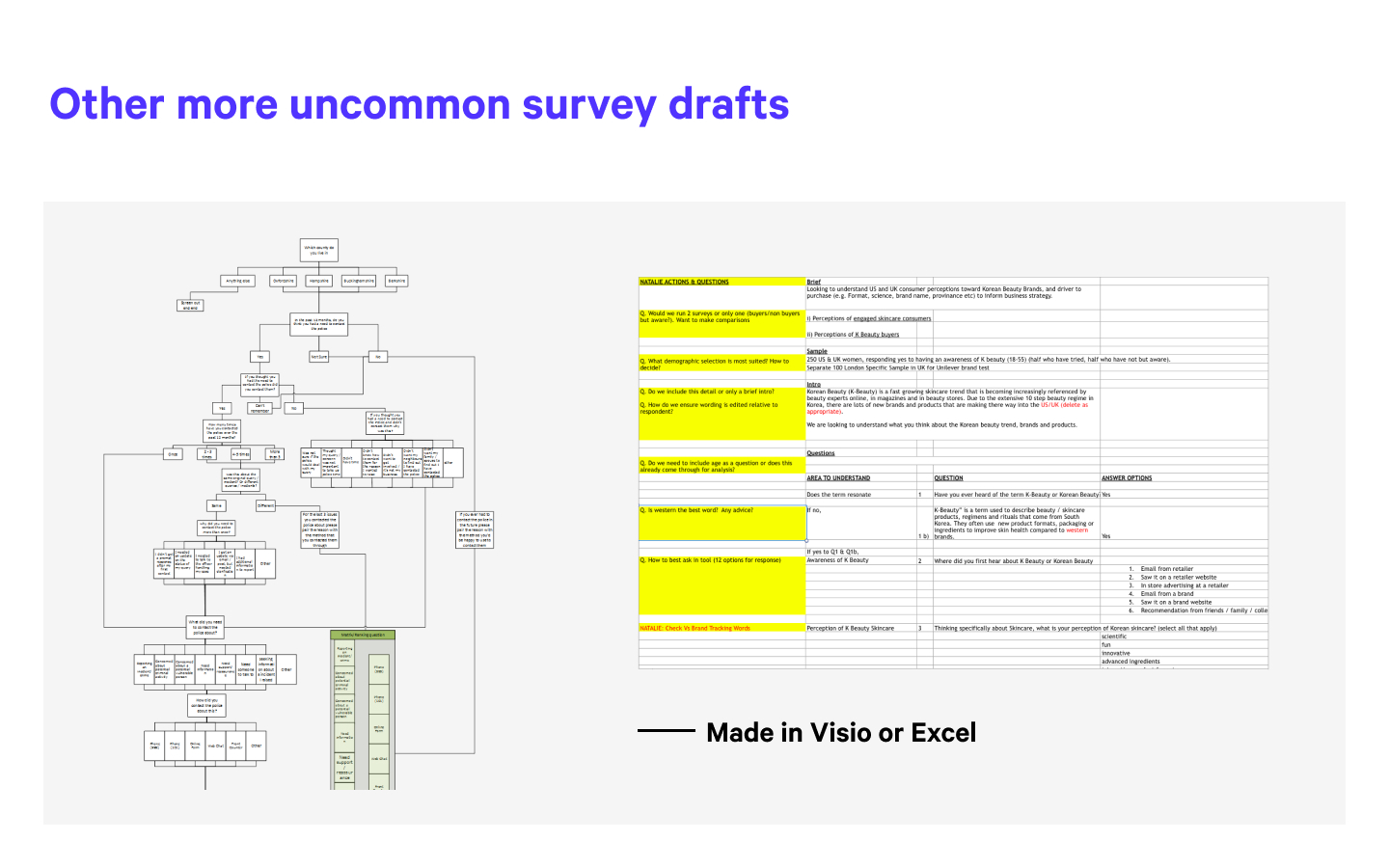
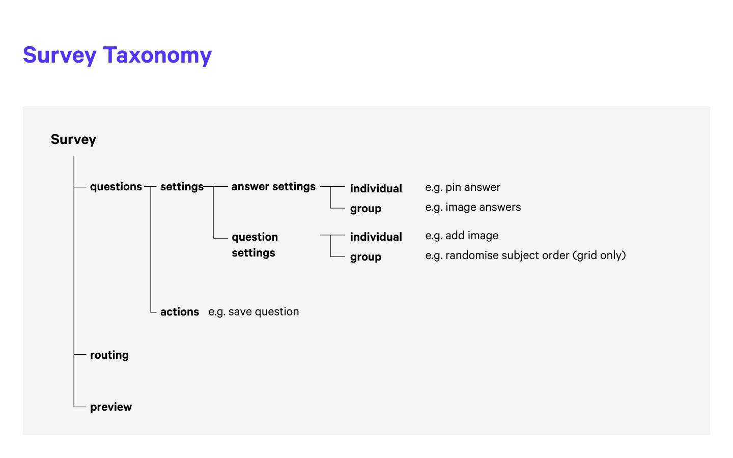
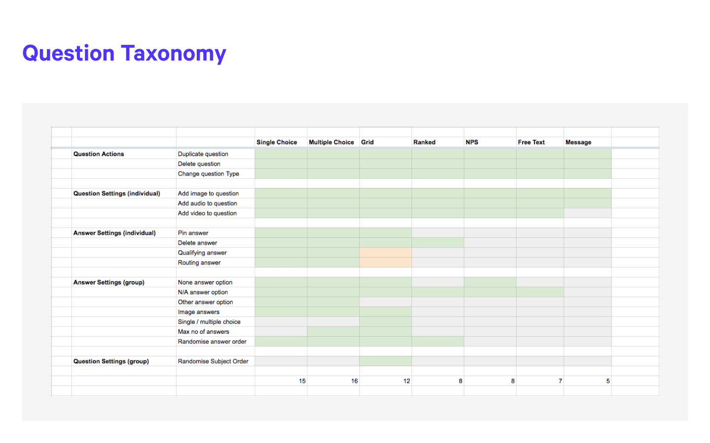
The complete survey creation flow was reconsidered. An incredibly complex and non-linear production flow which would typically include multiple drafts of both questions and answers, utilising templates, choosing audience demographics and creating different routes based on different answers.
The Prototype
Flower Journal
After several iterations of wireframes, I built out a functioning prototype of the drafting and routing flow in Origami studio. This was so that user testing most closely approximated the experience of writing and constructing a survey.
The existing Bloom & Wild blog was proving not fit for purpose. Less than 1% of visitors to the site included a blog page in their journey and of those that landed on a blog page the conversion rate was very low.
In addition there were problems with the design — modules were not adapting well to different viewport sizes, and the design did not feel as premium and considered as the content it was housing.
After several iterations of wireframes, I built out a functioning prototype of the basic drafting and routing flow in Origami studio. This was so that user testing most closely approximated the experience of writing and constructing a survey.
View another project
My ProcessProject type
New CoProduct Design & Art Direction
Bloom & WildProduct Design
AttestProduct Design
MR PORTERProduct Design
ASOSProduct Design

On DeckProject type
