My Role:
Lead Product Designer (UI & UX)
My Role
UI Design
UX Design
I led a team of two other designers through a period of huge growth for the young company. Working across all digital products, we delivered key projects such as iOS and Android re-design, internationalisation, and checkout.
Flower Journal
Flower Journal
The existing Bloom & Wild blog was proving not fit for purpose. Less than 1% of visitors to the site included a blog page in their journey and of those that landed on a blog page the conversion rate was also less than 1%.
In addition there were problems with the design — modules were not adapting well to different viewport sizes, and the design did not feel as premium and considered as the content it was housing.
The existing Bloom & Wild blog was proving not fit for purpose. Less than 1% of visitors to the site included a blog page in their journey and of those that landed on a blog page the conversion rate was very low.
In addition there were problems with the design — modules were not adapting well to different viewport sizes, and the design did not feel as premium and considered as the content it was housing.
The existing Bloom & Wild blog was proving not fit for purpose. Less than 1% of visitors to the site included a blog page in their journey and of those that landed on a blog page the conversion rate was also less than 1%.
In addition there were problems with the design — modules were not adapting well to different viewport sizes, and the design did not feel as premium and considered as the content it was housing.
The customer journey was re-considered. The link to the blog was tested and re-positioned on the homepage, whilst shoppable links were given clear priority.
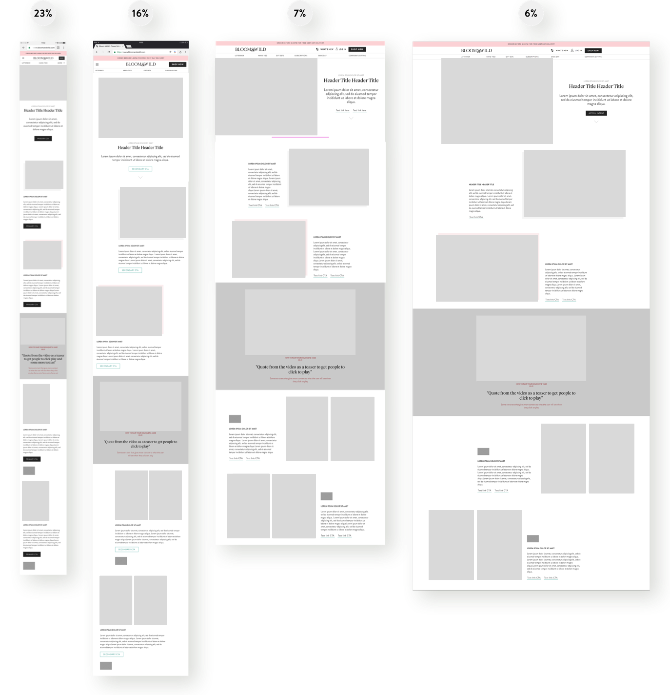
Wireframes took into consideration the most viewed viewport sizes to make sure that the modules worked well for the majority of visitors.
After the changes, visits to the blog pages increased by 2% and conversion from those pages increased by 2.5%.
iOS & Android App:
Order Tracking
iOS App:
Order Tracking
iOS App: Order Tracking
iOS App:
Order Tracking
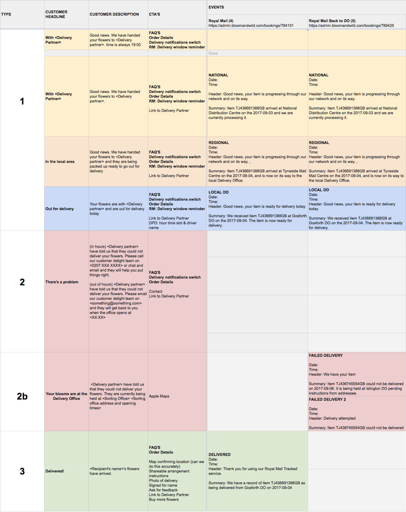
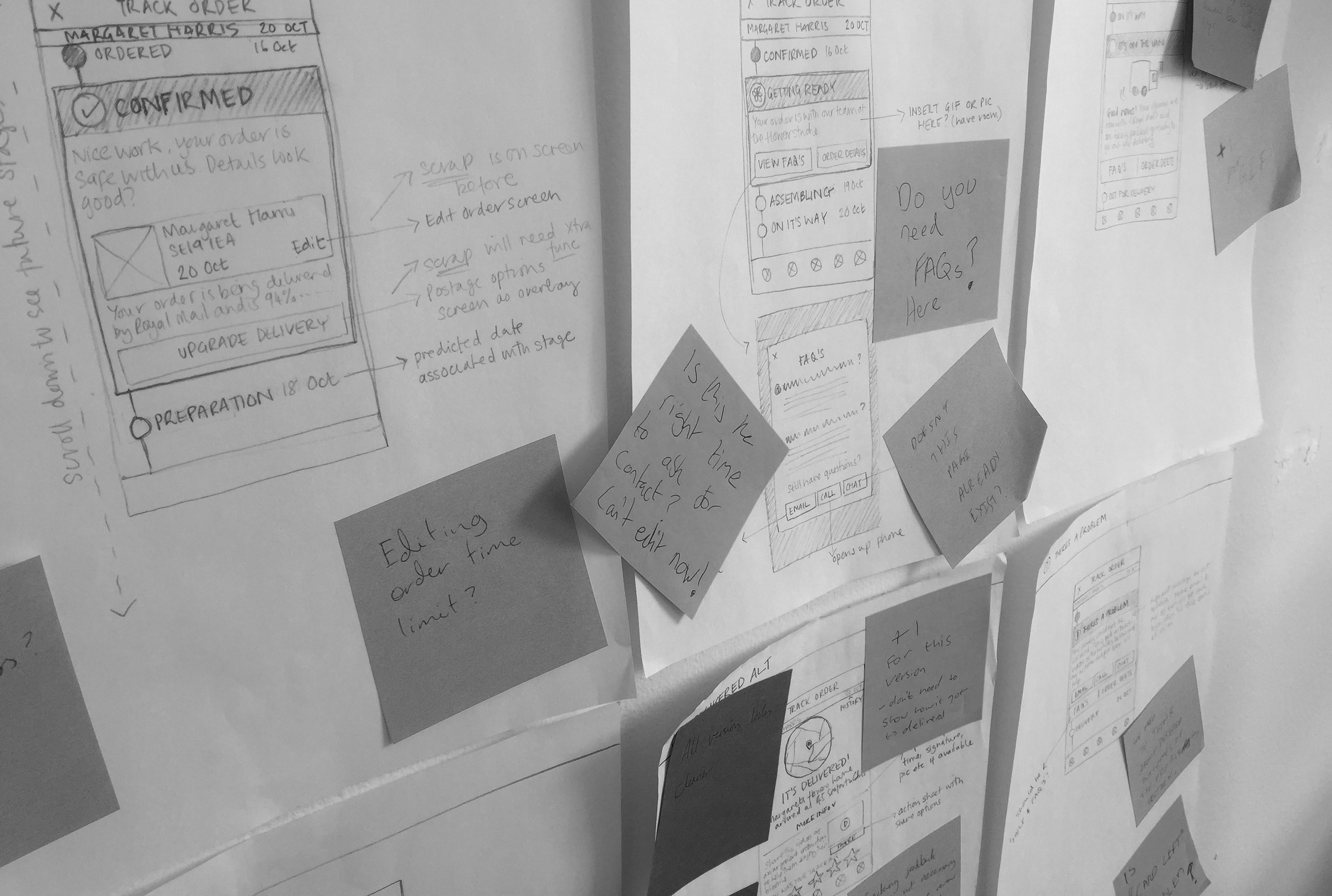
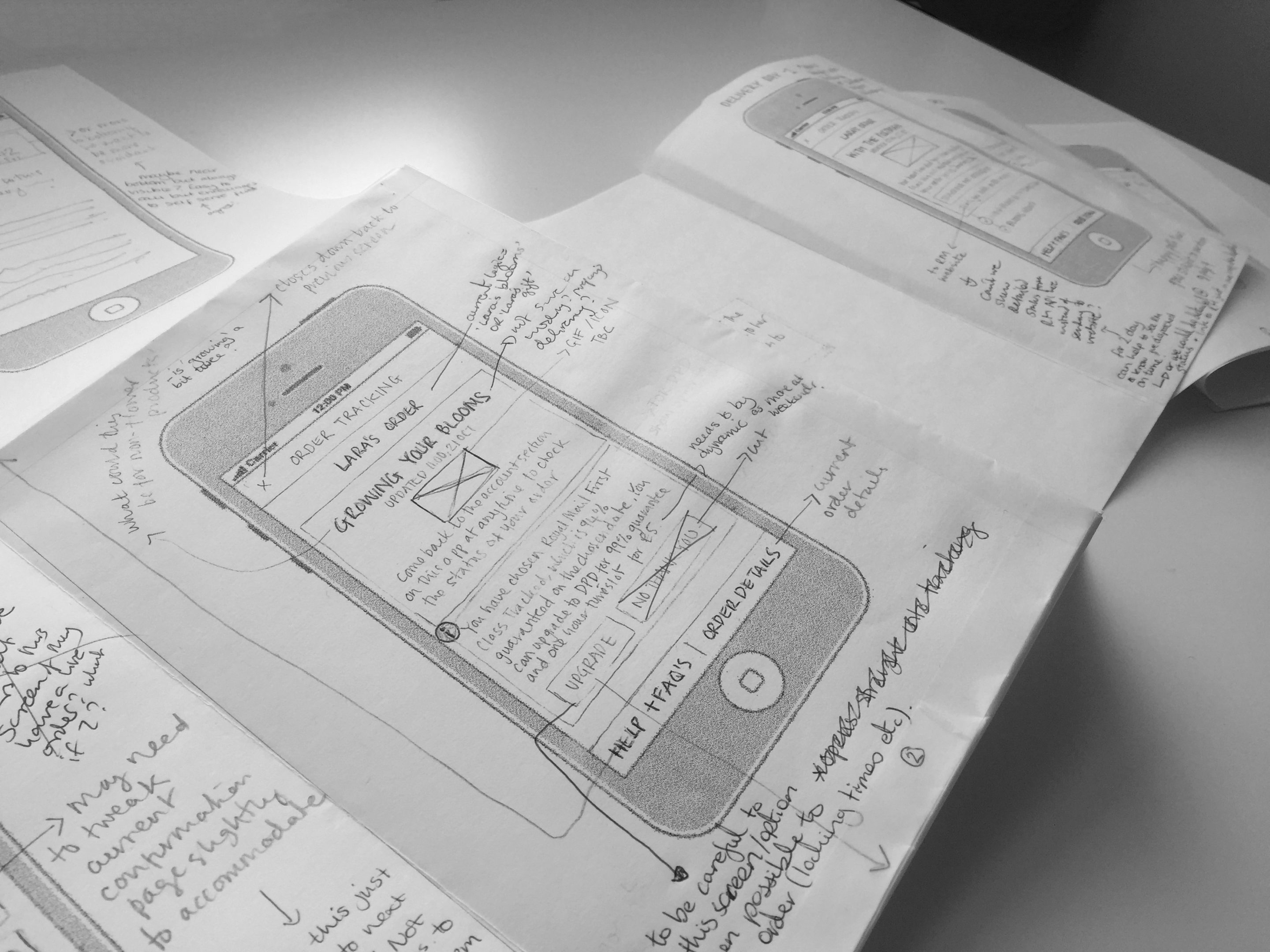
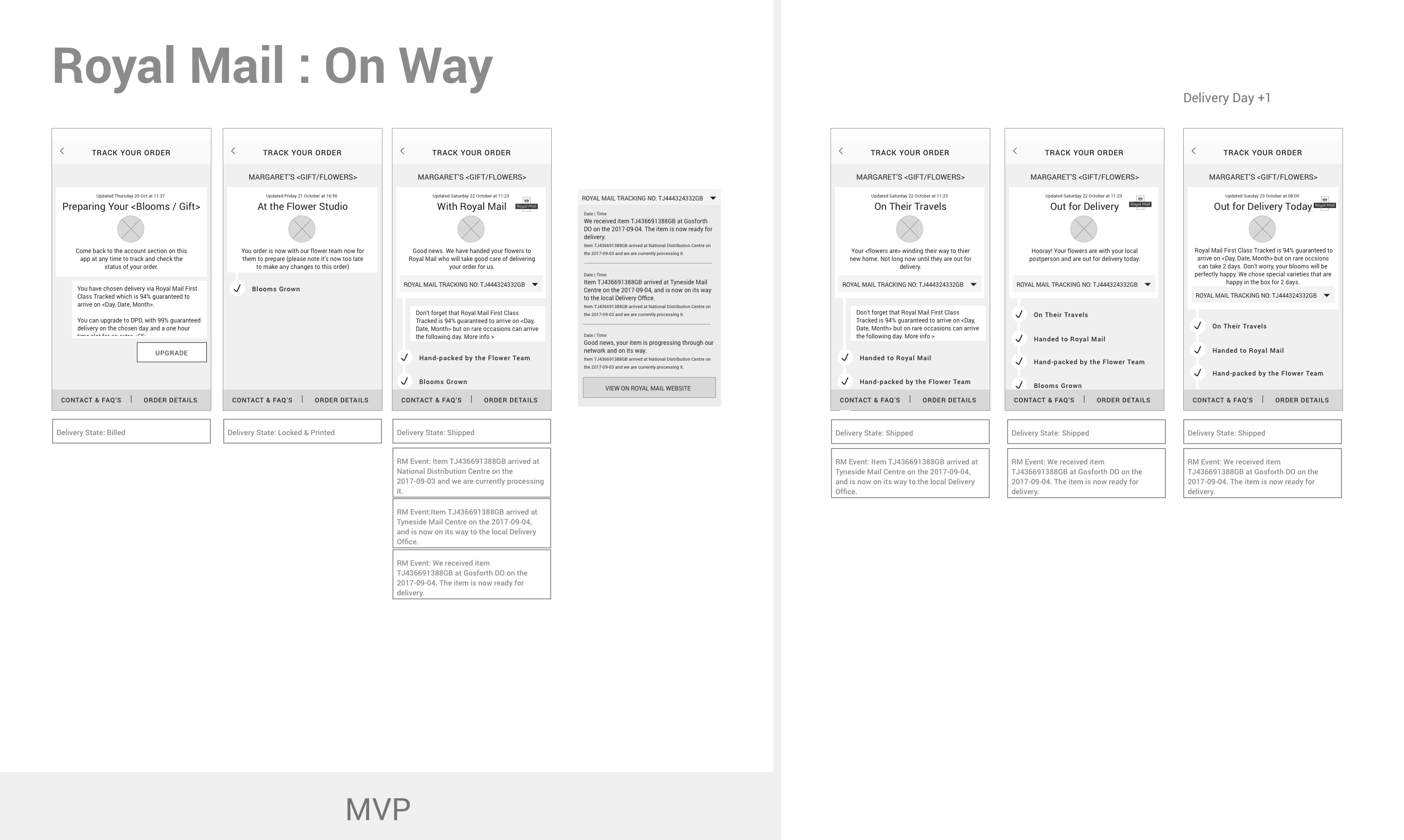
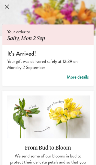
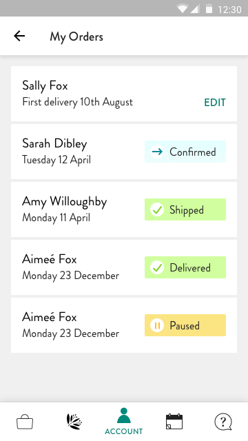
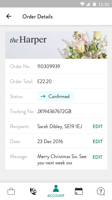
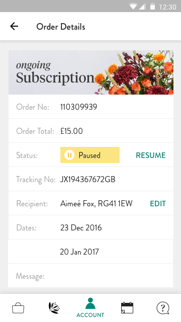
A timely and smooth delivery experience is especially critical to a flower delivery service. Working with data and customer delight teams we identified that there was a need to provide more information during this part of the user experience.
80% of NPS detractors had a concern about delivery, and 15% of customer delight inquiries were about delivery status. In the first month after launch, this went down to 71% and 9% respectively, leading to a drop in detractors and easing the burden on customer delight.
Android App
Android App
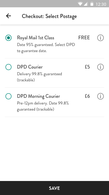
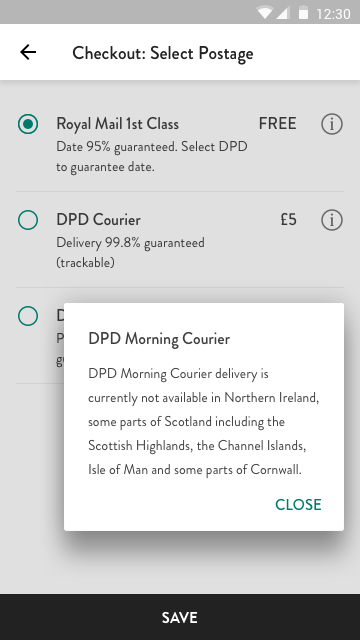
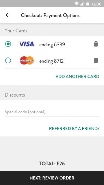
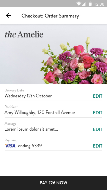
As the move to mobile was growing strongly month on month, there was a real need to improve the experience of the Android app, which was lagging behind iOS by several years.
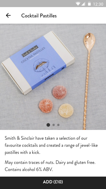
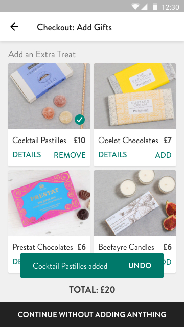
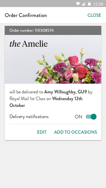
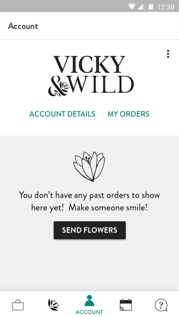
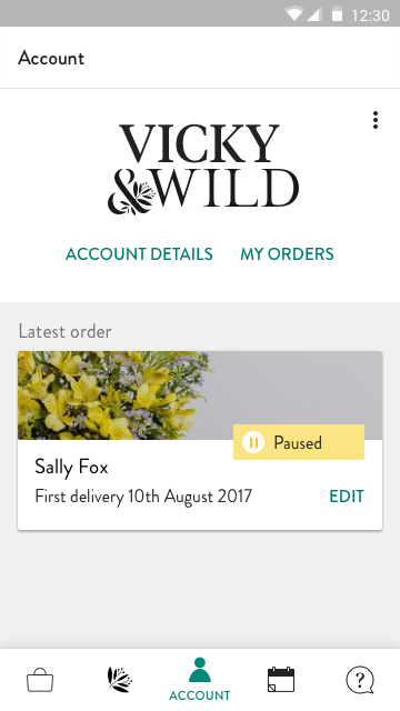
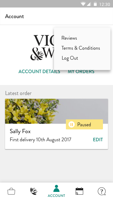
Working closely with the mobile engineers, I designed an experience that felt native to the Android platform, whilst pushing some of its conventions and styles to be something uniquely Bloom & Wild.
The re-designed app was featured on the Play Store and conversion increased by a massive 8%.
As the move to mobile was growing strongly month on month, there was a real need to improve the experience of the Android app, which was lagging behind iOS by several years.
Working closely with the mobile engineers, I designed an expereince that felt native to the Android platform, whilst pushing some of it's conventions and styles to be something uniquely Bloom & Wild.
As the move to mobile was growing strongly month on month, there was a real need to improve the experience of the Android app, which was lagging behind iOS by several years.
Working closely with the mobile engineers, I designed an experience that felt native to the Android platform, whilst pushing some of its conventions and styles to be something uniquely Bloom & Wild.
The re-designed app was featured on the Play Store and conversion increased by a massive 8%.
01
Shop
01
Shop
02
Checkout
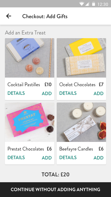
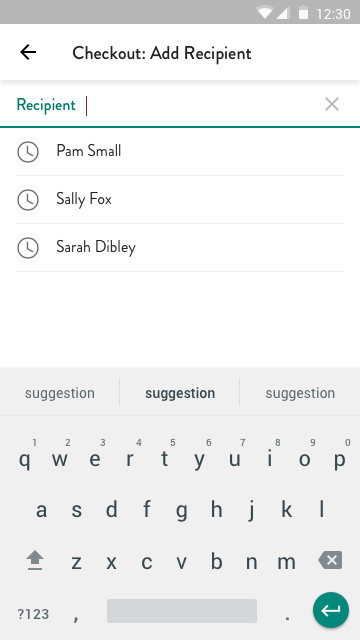
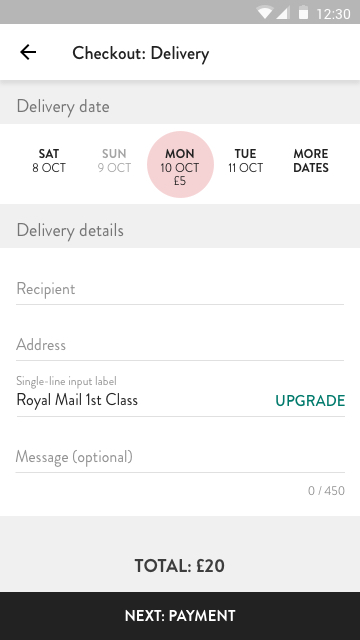
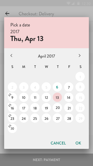
03
My Account
03
My Account
The many projects that my team worked on including internationalisation, adding a shopping basket, order tracking and app re-designs helped contribute to Bloom & Wild's growth from 4 million to 13 million revenue per year in my time there.
Some metrics from key projects:
Increase in repeat rate
+5%
Average order value after basket added
+7.5%
View another project
My ProcessProject type
New CoProduct Design & Art Direction
Bloom & WildProduct Design

AttestProduct Design
MR PORTERProduct Design

ASOSProduct Design

On DeckProject type
